How to write a sales email people will actually read (with examples)
Learn how to write sales emails people read and respond to with clear subject lines, strong hooks, simple frameworks, and high-impact formatting.
Your prospects are drowning in cluttered sales emails full of dense paragraphs, buried action items, and unclear next steps. If someone needs to read your email twice just to figure out what you want, they probably won't bother responding.
The best sales reps know how to write a sales email and ensure they are super-skimmable. Not because they're lazy, but because they respect their prospects' time. Think about it: you're reading this on your phone right now, probably between meetings. That's exactly how your prospects read your emails. So why send walls of text?
Here are three ways to write sales emails that people can scan in seconds.
1. Write subject lines that get opened
Your subject line is the gatekeeper. If it's vague, generic, or salesy, your email never gets read. The best subject lines are specific and relevant. Skip "Touching base" or "Quick question." Instead, reference something concrete from your last conversation, mention a mutual connection, or lead with a clear benefit.
Keep it under 50 characters so it doesn't get cut off on mobile, and make it scannable at a glance, because your prospects are triaging their inbox in seconds. Here are some good subject line examples:
- "RE: Q1 pricing for 50-seat rollout"
- "Sarah mentioned you're hiring SDRs"
- "30% faster close rates (case study)"
- "Your demo follow-up + next steps"
- "Answer to your integration question"
2. Hook them in the first line
You have one sentence to prove this email is worth reading. That's it. So, start with why you're reaching out and why it matters to them right now. Not your company story, not your product features, not a paragraph of pleasantries.
Lead with context they care about. Reference a trigger event, a pain point you know they're facing, or a specific result you can help them achieve. Make the first line do the work of pulling them into the rest of your email.
For example, you could start with: "Saw you're hiring 3 SDRs this quarter. Here's how we helped a similar team cut ramp time from 90 days to 30."
3. Use the 3x3 email framework
Prospecting emails are the worst offenders. Many people write long essays with backstory, context, and detailed explanations when your prospect just wants to know what you're offering and why it matters. The 3x3 email framework keeps things concise:
- No chunk of text can be longer than 3 lines
- Each chunk of text = 1 idea
- Eliminate preamble words
- Everything must fit on one phone screen (the no-scroll rule)
Here’s an example of a good 3x3 email:
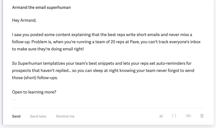
The first paragraph shares the context and problem, the second paragraph shares the solution, and the last block of text ends with a short CTA. It's really that simple. Sales emails don't need to be more complicated than this.
You can break the "no-scroll rule" for thorough emails like Joint Execution Plans (JEPs), technical explanations, or answering multiple prospect questions. But for prospecting, recaps, or proposals, fit everything on one screen.
4. Layer your big emails with colors, bullets, and bolding
Your prospects are scanning emails in seconds, not reading them carefully. If they have to hunt for the point or squint at a wall of text, they'll move on. That's why you need a visual system that makes your emails instantly readable.
Here are the golden rules that transform dense emails into something your prospects can scan in seconds:
- Use bold underline for sections
- Use bold for headers
- Use red for action items
- No more than 4 bullets, 2 lines each
Now, let's use them and transform a clunky sales email into a short, skimmable message.
Imagine that you're getting to the finish line and approaching vendor review in a sales cycle. It's common at this stage for sellers to write ridiculously long emails with questions, action items, and recaps lumped together. It might look like this:
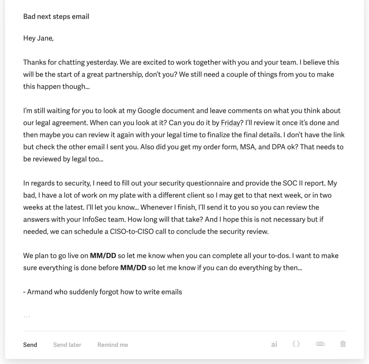
Sure, there are a lot of moving parts. Multiple workstreams are going on with multiple action items in each workstream. But if you send your prospect a wall of text like this, you're giving them no clue what to do with it.
Compare that to the example below. Using the golden formatting rules, you can turn this into a mini mutual action plan (MAP) email where we section out each work stream and make it abundantly clear what needs to be done by whom.
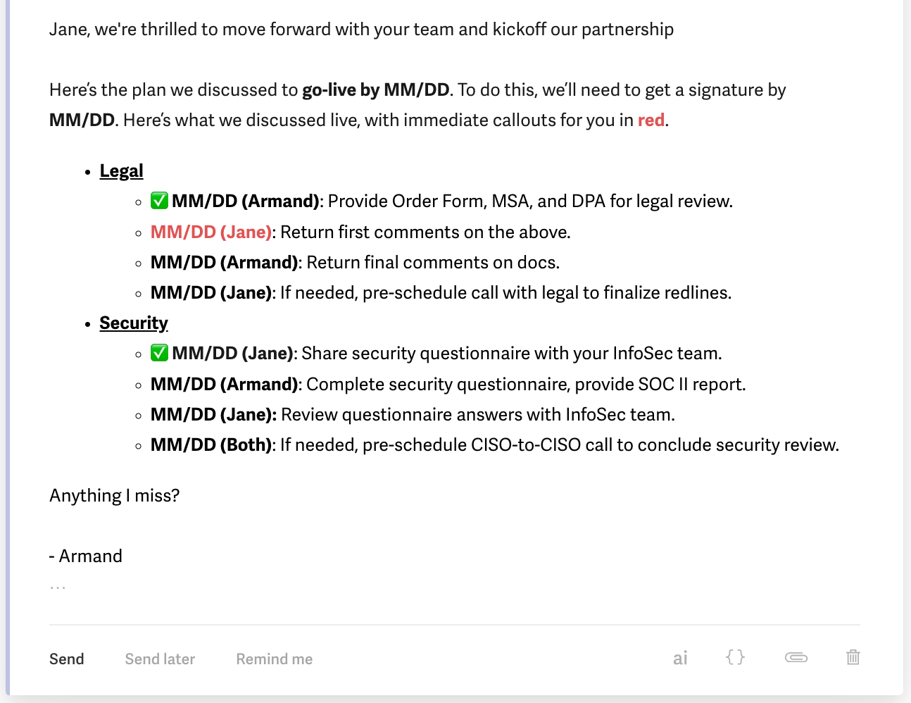
This email is easy to read, clear, and succinct. Just the way sales emails should be.
5. Make your call-to-action crystal clear
Your prospect just read your email. Now what? If they have to figure out the next step, they won't take it. To avoid this, end every sales email with one clear action:
- Bad CTAs are passive and unclear, like "Let me know if you'd like to chat" or "Happy to answer any questions."
- Good CTAs are direct and easy. For example, you could say "Does Tuesday at 2pm work for a 15-minute call?" or "Reply with your team size and I'll send over pricing."
Make it as easy as possible to say yes. The clearer your ask, the faster you'll get a response.
6. Structure your replies to questions
Prospects send you unstructured questions all the time. Random order, no clear priority, everything jumbled together, just like this:
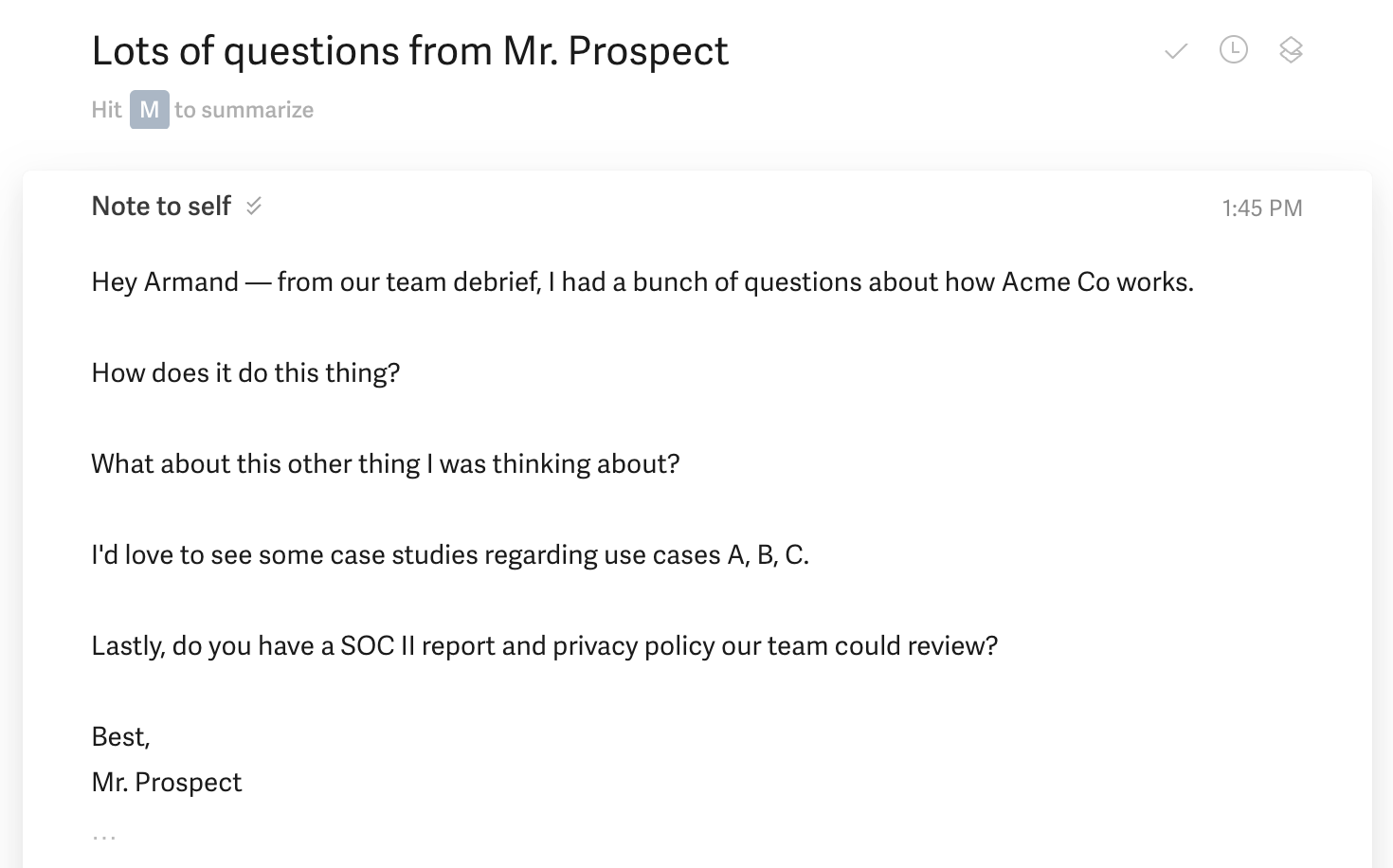
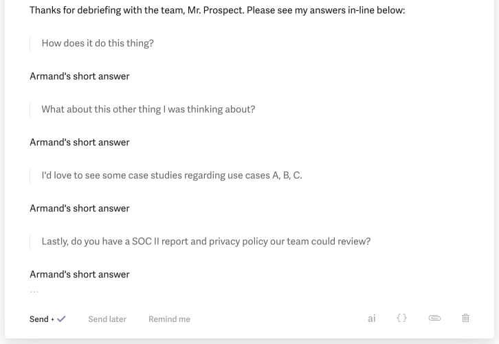
Don't mirror that chaos in your response. Structure your reply in blocks, with each answer directly below its question. This shows your prospect that you heard them and answered everything they asked.
Here’s how that might look:
7. Send emails when prospects actually read them
Timing matters. Send your email at 2 am, and it's buried by morning. Send it during lunch, and it gets lost in the flood. The best times to send sales emails are early morning (6-8am) when prospects are clearing their inbox before meetings start, or late afternoon (4-5pm) when they're wrapping up their day and planning tomorrow.
Avoid Monday mornings when inboxes are overflowing from the weekend. Tuesdays through Thursdays typically get the highest response rates. And if you're reaching out across time zones, schedule your email to land during their work hours, not yours.
Write skimmable sales emails easily with Superhuman Mail
Sales reps who master skimmable emails close deals faster. Superhuman Mail gives you the tools to write crisp, scannable messages that prospects actually read. Teams using Superhuman Mail respond to twice as many emails in the same amount of time and save 4 hours per person every week.
The features that turn cluttered sales emails into skimmable wins:
- Superhuman AI learns how you write and drafts full emails from just a few words, so you can bang out clear, structured messages in seconds instead of minutes.
- Snippets let you build a library of formatted templates for common sales scenarios that you can drop into any email with a quick shortcut.
- Split Inbox surfaces replies from hot prospects first, so you're always responding to the deals that matter most without digging through noise.
- Auto Reminders tap you when it's time to follow up, keeping your pipeline moving without manual tracking.
- Instant Reply gives you one-click response options for quick acknowledgments, so prospects never wait while you're juggling other tasks.
Try Superhuman Mail to make skimmable, effective sales emails your default.
