What are the easiest fonts to read?
The easiest fonts to read often depend on the context — where and how you're using them. Here's how to choose the right font for your needs.

Um, let's try that again.
What we were trying to say is this: when conveying any information in text, the font you choose can have a major impact on how your message is received, and even people's ability to read it. Case in point: the above text, which is near-impossible to read on a screen and seriously distracts from the message being written.
The easiest fonts to read can vary depending on where you're using them — the perfect font for a banner might be different from the clearest font to use on your website, for example. But that doesn't mean any guesswork is required to choose the right font — there are some helpful tips and general rules you can follow to ensure you're choosing a font that's accessible, legible, and easy to read. Here's what you need to know.
What makes a font easy to read?
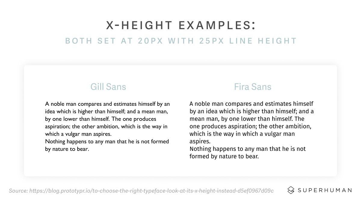
There are a lot of different factors that can make a font easier or harder to read. Some of the better known factors are things like spacing, size, colors, and whether the font is decorative or utilitarian. But there's also serifs — the little tails that come off the letters and help guide the eye from one character to the next, but can make a font difficult to read if it's on a small scale. And then there's x-height — the distance between the baseline of the text and the tops of the main bodies of lower-case letters, which helps determine whether the font feels open or cramped.
And as we've transitioned from reading mostly on paper to mostly on screens throughout the digital age, some conventional wisdom about the easiest fonts to read has changed. In some cases, a font that's clear and legible in print isn't as easy to read on a website, for example — especially on a small screen like a smartphone.
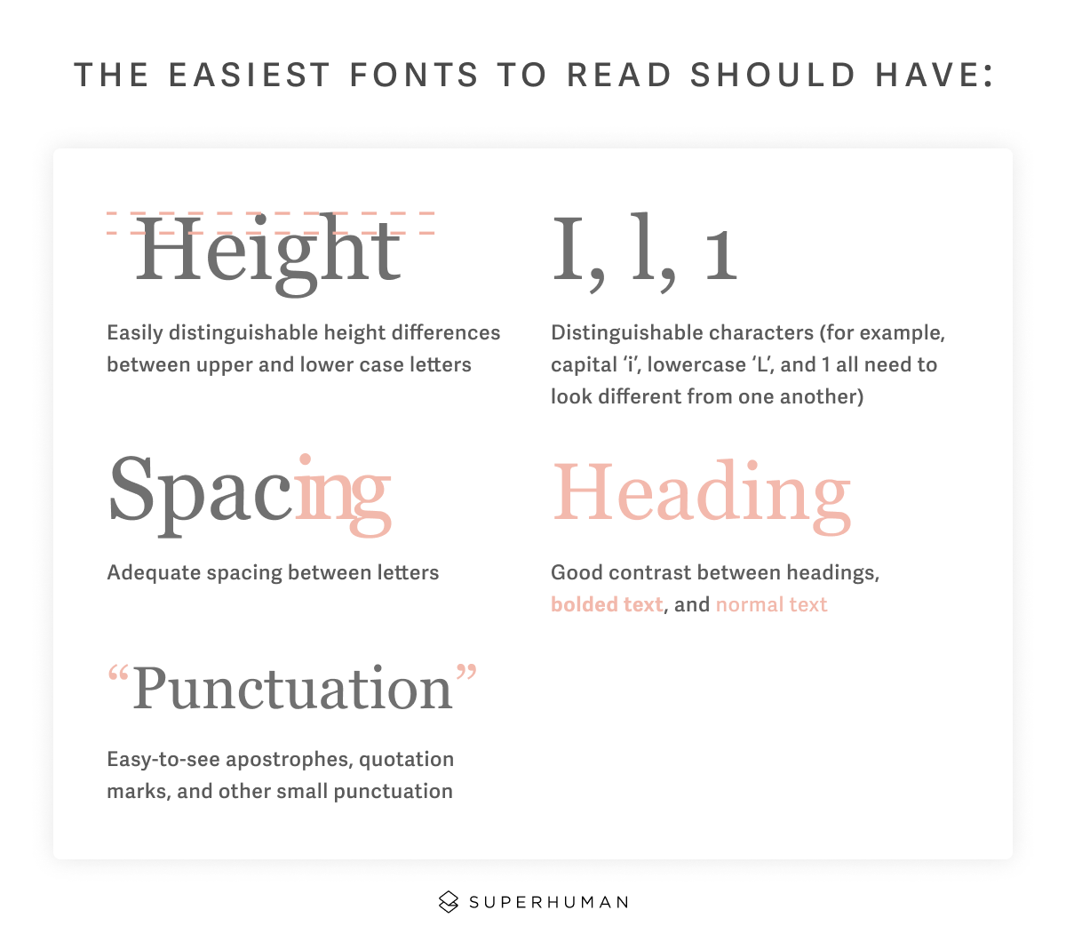
But there are still plenty of rules of thumb that apply. The easiest fonts to read should have:
- Easily distinguishable height differences between upper and lower case letters
- Distinguishable characters (for example, I, l, and 1 all need to look different from one another)
- Adequate spacing between letters
- Good contrast between headings, bolded text, and normal text
- Easy-to-see apostrophes, quotation marks, and other small punctuation
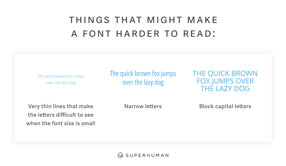
On the other hand, things that might make a font harder to read include:
- Very thin lines that make the letters difficult to see when the font size is small
- Narrow letters
- Block capital letters
Another factor to consider is whether a font is available to you. Some of the easiest fonts to read, like GDS Transport, BBC Reith, and FS Me, have been developed specifically with readability in mind. But they aren't readily available because they're copyrighted.
Why is it important to use an easy-to-read font?
A clear, easy-to-read font is what makes your content legible and accessible.
To show how important this is, let's look at what happens when you don't use an easy-to-read font.

As you can see, with certain fonts, different words and letters can look so similar that it's hard to distinguish between them. This can make your text difficult to read, digest, and understand, leading to a whole host of problems — legibility can be the difference between someone clicking your ad or ignoring it, or someone converting into a customer or going with a competitor.
It's also important to note the impact that font choice has on accessibility. The best font should be easy for anyone to read, but some fonts are better than others for people with certain learning disabilities or visual impairments, especially older people.
These are the easiest fonts to read
With all of that in mind, these are some of the most popular fonts, which are also broadly considered to be the easiest to read. In some cases, the best font will depend on where and how you're using it (we'll get into that more below), but you can rest easy choosing any of these — all highly readable fonts, regardless of the content and application.
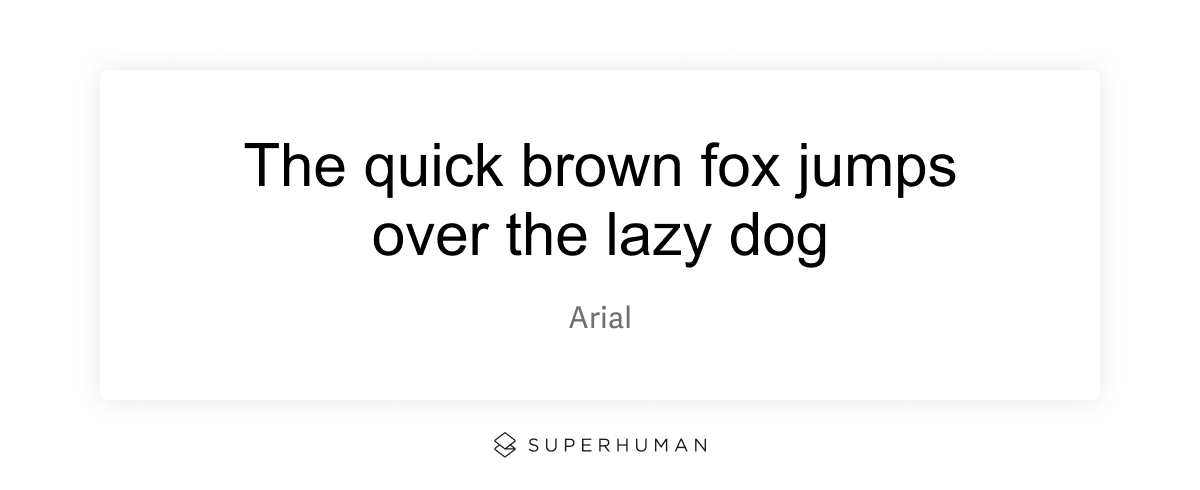
Arial
Arial is one of the most popular and legible fonts you can find. It's very organic-looking, featuring natural strokes and an open design. While Arial is designed primarily for print use, it makes a good web font because of its openness.
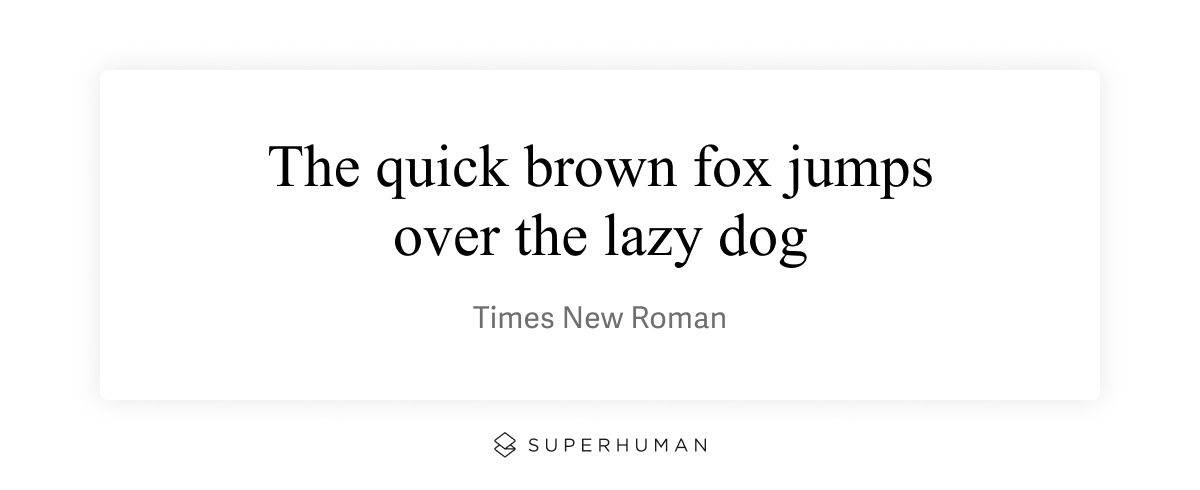
Times New Roman
Times New Roman has long been the standard for both print and web documents. There's a reason for that: simple and straightforward, Times New Roman is extremely legible at a wide variety of sizes, as well as in bold, italics, and headings. Despite its relatively small x-height, Times New Roman is definitely one of the easiest fonts to read.
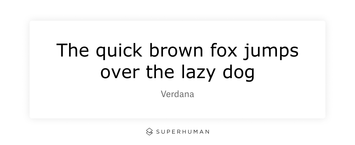
Verdana
Verdana was created by Microsoft to be an ideal font for web documents. But because of its open design and distinctive letter shapes (it's extremely easy to tell the difference between "n" and "h", for example), Verdana has become beloved for its legibility in all kinds of contexts.
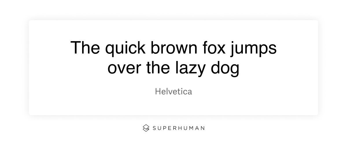
Helvetica
Helvetica was created in 1957 by Swiss typography designer Max Miedinger. It became almost an instant hit, due to its clean, professional look. Helvetica is a sans serif font, which means the individual characters don't have serifs (tails and other ornaments). Instead, it features tall, thin letters with tight spacing. What makes it one of the easiest fonts to read is that it's extremely legible up close or at a distance, and in large or small sizes.
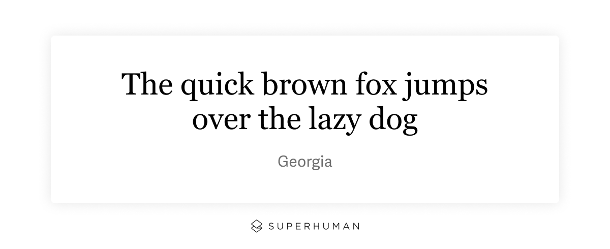
Georgia
Georgia was designed specifically to be a web font, and it delivers. Its hallmark is that it stays just as legible even at very small sizes, making it ideal for web content that may be read on a mobile device.
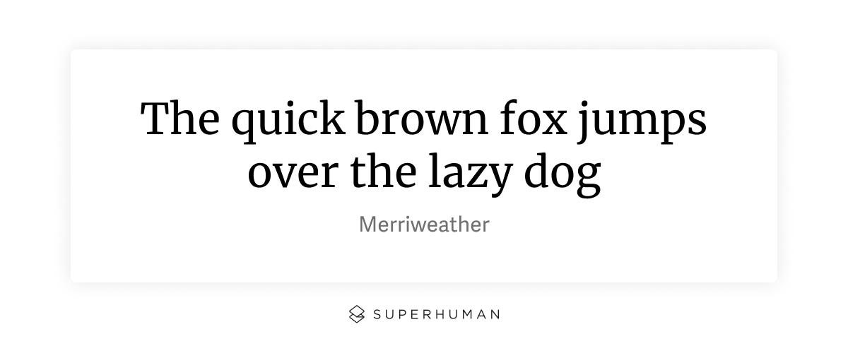
Merriweather
For anyone who's looking for an alternative to sans-serif fonts, there's Merriweather. Designed for web use by Google, Merriweather features semi-condensed spacing that still leaves enough space between letters for it to be legible at small sizes. Those who have been working in web design for a while might remember when Merriweather was the default for most Wordpress templates — and for good reason.
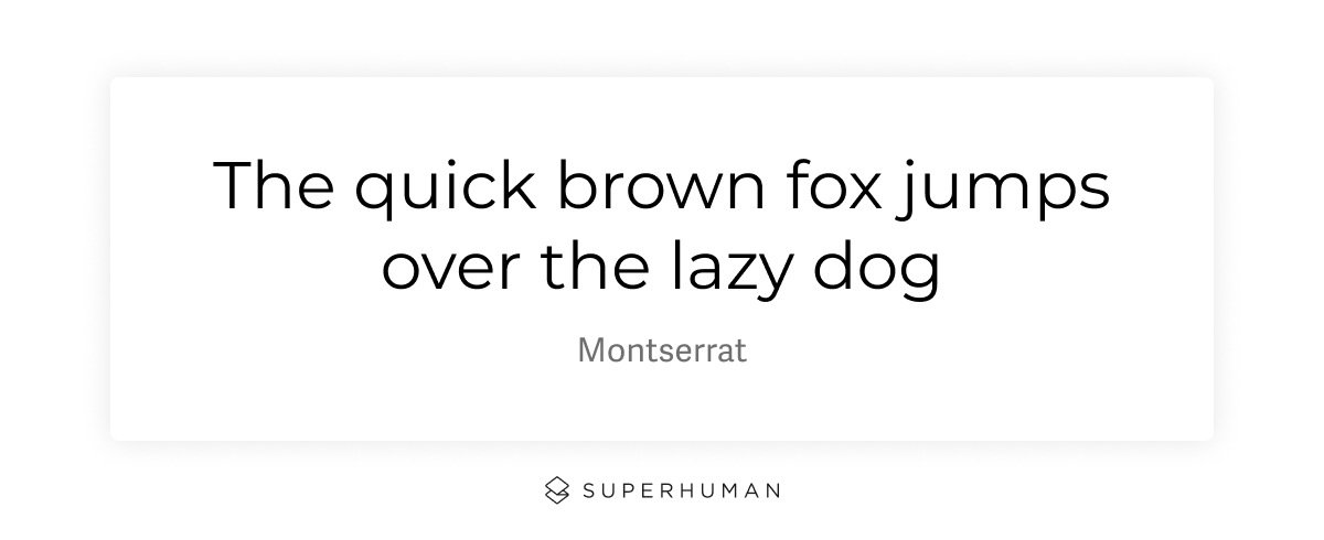
Montserrat
Montserrat was originally developed for use on signs, but in 2017, it was redrawn with a lighter weight to make it easier to read on the web — especially in long blocks of text, like the body text of a website. Since then, it's become a popular choice for both web and print, due to its high legibility and design that minimizes eye strain.

Futura
Even though it was originally released in 1927, Futura is named for its timeless style that makes it look almost futuristic, regardless of when it's used. With clean, thin character strokes and a geometric design, Futura is not only easy to read, but can be used in both casual and formal contexts.
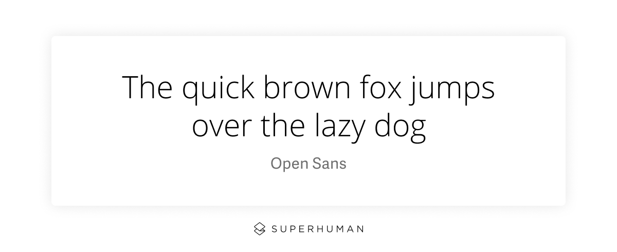
Open sans
As you may have noticed from this list, many of the easiest fonts to read are sans-serif typefaces. Open Sans is no exception. Designed in the digital age, Open Sans was meant to be a one-size-fits-all font for graphic design that could appeal to many different preferences while also staying extremely easy to read.
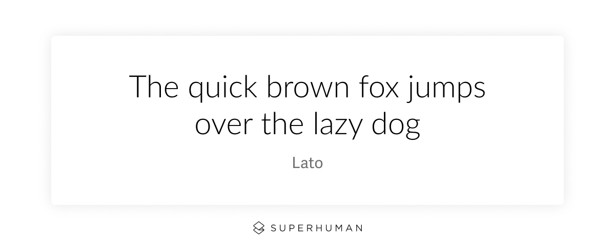
Lato
Lato is another Google-designed font that was made for the web. It features rounded letters that are professional and casual at the same time, making this font ideal for all kinds of use cases. The letter shapes are distinct, yet unobtrusive, making Lato extremely easy to read.
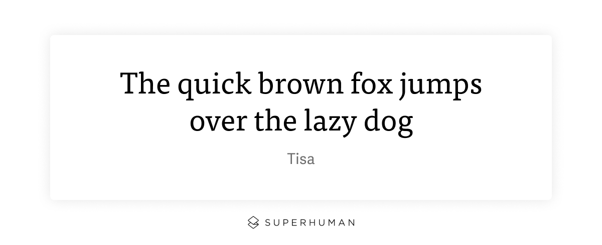
Tisa
Tisa features large x-height and wider-than-usual kerning (the space between each letter), making it easy to read in all sizes and contexts. Not only is Tisa super legible, but it's versatile, too.
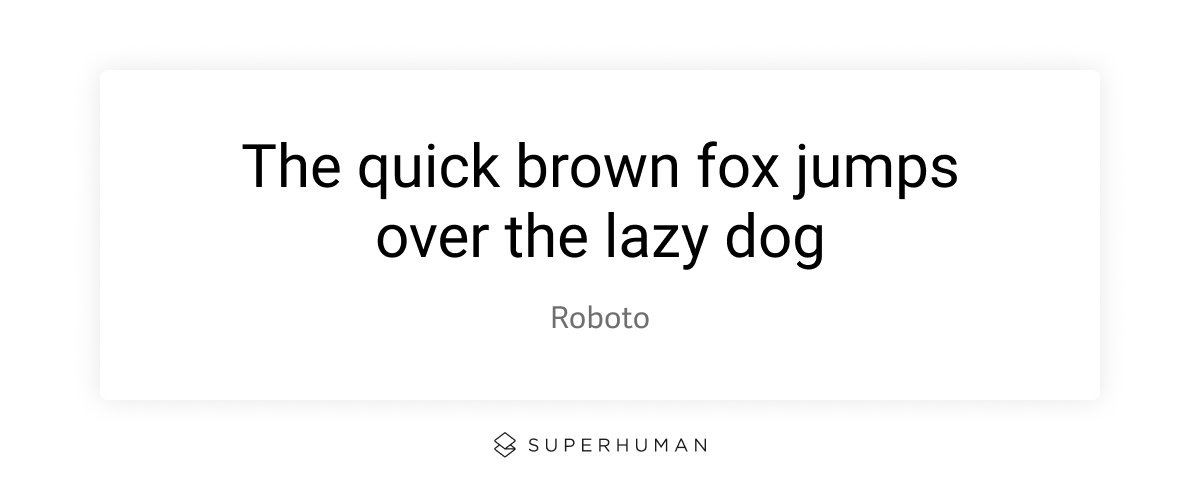
Roboto
Roboto is one of the newest fonts on this list, designed by Google specifically for its Android mobile operating system. But the font was found to be so widely appealing and easy to read, it's now the default for Chrome browsers, as well.
The best fonts for different use cases
While all the fonts on the above list strike a good balance between legibility and versatility, there are still certain fonts that are the easiest to read in certain contexts — namely, on a screen or in print.
Best fonts for webpages
The biggest challenge in choosing a font for the web is that different browsers may render fonts differently. For example, Firefox tends to render fonts with a heavier weight than other browsers. From a brand consistency viewpoint, this can be challenging — it can be difficult to ensure your chosen fonts look the same for all users.
Then there are matters of formatting. Design and spacing can vary for fonts meant to be viewed on computer screens, versus on paper. Digital fonts also need to be extra legible in small sizes, so they can be viewed easily on the smaller screens of mobile devices and wearable tech. That's why some fonts come in two versions: one for digital and one for print.
In cases of fonts that have online and print versions, it's also possible that the difference has nothing to do with the design, but the licensing. If you purchase a font for use in print materials, using it for live text on your website may violate your license agreement. That's another factor to consider.
With all of this in mind, some of the easiest fonts to read on screens include:
- Times New Roman
- Arial
- Verdana
- Helvetica
- Calibri
- Georgia
Best fonts for printed designs
Whether it's an internal report, a brochure, or a business card, the font you choose for a printed document is an important part of the message you're conveying. Is it professional? Does it match the tone of the overall document? Is it easy enough to read so that it doesn't distract from the message of the text?
For print fonts, serifs — the embellishments, like small tails, added to the base letters — help our brains recognize text and read easily — and quickly! — from one letter to the next. But many different fonts have serifs, and that doesn't automatically make them easy to read. You should also look for wide and open letters. The extra space also helps the brain recognize them more quickly, and reduces fatigue when reading, especially for large blocks of text.
With those tips in mind, some of the easiest fonts to read in print are:
- Helvetica
- Futura
- Verdana
- Georgia
- Garamond
These fonts can also help you read faster without subvocalization.
Choosing the right font means staying inside the box
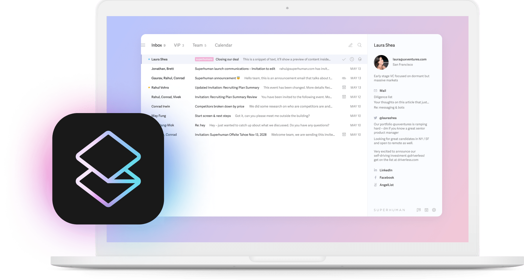
At Superhuman, we chose the font Adelle for our desktop experience. It works for a few reasons:
- It's a sans serif font that works well at a small scale. We looked into some serifs, but they could be hard to read in a large body of email text.
- It's not overly geometric. Its narrow width allows for many characters to fit into one line, something that's important when writing a text-heavy email!
- It stands out from sans serifs you might see on the web more often, but it's still very neutral in personality, meaning you can use it for any kind of content.
The bottom line about choosing the easiest fonts to read? Typography experts have perfected their craft, and it's best to trust their best practices.
When choosing a font, it can be tempting to pick something that will stand out. But at the end of the day, if your font is so memorable that it distracts from the content itself, it won't help you achieve your messaging goals.
Any of the fonts on this list are safe choices to start with, or you can search curated font libraries like Google Fonts or Adobe TypeKit for the perfect font for your project.