Infinity pools, extravagant dinners, luxurious furniture… going fancy can elevate your lifestyle. But when it comes to email signatures, fancy can work against you.
Prone to including your favorite philosopher's quote? How about multiple links to your latest side-hustles? A vanity bio? Your email signature can come across as disingenuous or unprofessional, or worse, make it look like you moonlight as Mickey Mouse on the weekend (yes, we've got an example of this).
Even if you deem your signature Pinterest-worthy, does it convey the right message? Does it hit the right mark and leave a lasting impression? Or does it risk taking you further away from your goals, muddling the original intent of your email?
In this article, we'll discuss the benefits of email signatures and why being too fancy might not always work in your favor. We'll also look at some examples and the hidden messages they could be conveying and provide pointers on how to craft the "perfect" email signature.
Fancy email signatures: when they work (and when they don't)
Email signatures are small yet important details that accompany our professional correspondence. We put a personal stamp on every email and tell our readers who we are and what we stand for.
Email signatures also provide many benefits:
- Professionalism: Including your business information and role legitimizes your experience and professional status.
- Helps brand your business: Including your company logo increases brand awareness.
- Exposure: Promoting your company and profiles with outbound links increases exposure.
- Accessibility: Providing contact details allows email recipients to forward your information and find you in other places online.
- News and updates: Providing company updates keeps your contacts aware of important changes.
- Special campaigns: Including special offers, discounts, product launch information spreads awareness of your special promotions and campaigns.
A simple email signature is classic and professional, and as long as you include basic information (role, email, phone, website, social profiles), it should suffice.
Is your email signature working against you?
If you try to get too fancy, the following can happen:
- It delegitimizes your professional role or job title.
- It doesn't format correctly on all devices.
- It turns people off with excessive or flashy graphics.
- It makes you look disorganized and chaotic, with excessive images and varying fonts.
Later we will discuss how to craft the perfect email signature. But first, what if your email signatures are broadcasting a message you're not aware of?
Read on to discover what your email signature could be communicating to your contacts, and find out if it is working for you or against you.
Hidden messages in your email signature: what it really says about you
Good email signatures will leave a lasting first impression! But what does your email signature say about you?
Email signatures can give off a vibe and communicate hidden messages you might not be aware of, especially if you try to get super fancy.
Let's take a look at a few examples. What do you think of when you see these professional email signatures?
"They're a digital hoarder"
Sometimes too much is, well, too much.
To make an email signature more interesting, some people can go overboard. And it can look like they're trying to cram as much information in one place as possible — which is kind of what a digital hoarder might do.
Maybe you're using multiple colors and font styles in an attempt to make your signature stand out. Or you're trying to fit a lot of information about your company in a tiny space. The problem is that too much variation can look disorganized and cluttered and come across as unprofessional.
One to two font colors and styles are generally enough in most cases, unless you're a designer or an artist who is deliberately trying to showcase your style. Scroll on to see an example of this later in the article.
Further Reading: What are the easiest fonts to read?
"They're super into hugging"
I'm a big fan of inspirational quotes (and hugging!), but covering your email signature in a plethora of quotes can give off the wrong vibe, well, unless you're giving away free hugs.
Are all inspirational quotes bad? Of course not. If you add an inspirational quote to your email signature, just ensure that it connects with your brand and doesn't overtake the signature.
"They moonlight as Mickey Mouse on the weekend"
If your profession is more serious (criminal lawyer) or can even come across as a tad shady (used car salesman), but you're trying to look more approachable and trustworthy, a gushy quote might send the wrong message. It might make you appear out of touch or even somewhat bizarre, the opposite of what you're going for.
"They made their email signature in Paint"
Ah yes, the DIY email signature.
If you're trying to appear professional and successful, but your email signature looks like it was designed in 1995, people might think your business is not successful because you didn't have enough money to hire a professional designer.
Forgo the corny clipart and cheesy quotes. It's OK to have a basic yet professional email sign-off! If you have a tight budget, all you need is enough contact information for people to find you.
"They're only interested in my money"
When you try to oversell in your email signature, people can get the impression that you're salesy and inauthentic. It might not be accurate, but that's how you could come across.
Your email signature shouldn't look like a promotional billboard! We love using email signatures for promotional links as long as they're subtle and understated. Read on to see an example of this in the next section.
"They're addicted to selfies"
Awards and accolades are valuable ways to show your work ethic and talent. But adding too much self-indulgence in your email signature can make you look conceited and stuck on yourself.
The framework for crafting the perfect email signature
In this section, we want to introduce you to a framework for crafting a simple yet concise email signature that makes you look professional and trustworthy.
The right balance of information:
At a minimum, include enough information so contacts can find you online or offline.
At a minimum, include your:
- Name
- Company name
- Professional role
- Contact information (email, website, or phone number): Some people say that including your email in your signature is redundant, but we think it's OK. Some people might not want to take the extra step and scroll back up to find your email (though in Superhuman, simply hitting R will compose a reply). Keeping all of your information in one place is helpful for contacts.
- Social media links: If you're on social media, include clickable icons or links to your profiles.
- Logo or professional image: It's not a deal breaker if you don't include a logo or a professional headshot, but images convey legitimacy and authenticity.
Here's an email signature example without a graphic. It includes the basic information, which still looks professional.
Here's the same email signature but with the logo added. It perks up the signature, adds a level of visual interest, and boosts brand awareness.
Simple and concise
We talked about adding promotional links and images to email signatures. Regardless of what you add, keep it simple and concise, so it doesn't appear too cluttered.
If you add images, keep them minimal and balanced with the text. If you have special calls to action or offers, add no more than one or two links.
Here's an example of an email signature with a call to action that stands out but doesn't appear overly promotional.
This email signature also portrays how you can use color without going overboard. The person's name and call to action are a different color than the other text, but it's not distracting.
Here's another example of an email signature with different font colors that is classic and is not overdone. Notice how she also bolded her role to call attention to it, yet the signature is still not overwhelming.
If you're wondering if your email signature is too busy or chaotic, step away from it for a few hours and come back to it, looking at it as a whole. Send it to trusted friends or acquaintances and ask them for their opinions as well.
Email signature additions (when you want to get a little bit fancy)
If you want to elevate your email signature without going overboard, here are some pointers:
Understated inspirational quotes
Below is an example of adding inspirational quotes to your email signature. Notice how the quote connects with the brand's messaging, is understated, and doesn't overtake the signature.
Quotes can enhance your email signature as long as they are on-brand and not excessive. They should never be the main focus, but simply strengthen your message and branding.
Minimal promotional links
Adding calls to action in your email signatures can be an easy way to promote your brand or broadcast news or special campaigns.
Include calls to action but be careful not to overdo it. One call to action is enough as long as it's not overwhelming. When I was creating mine below with my team, we wanted to make sure the CTA didn't overtake the signature but remained prominent enough to get noticed.
Professionally branded color and style
Earlier in the article, we showed you how fonts and colors could go very wrong! But that doesn't mean you should avoid color and detail variation in your email signature as long as it's professional and brand-focused.
This graphic designer's "fancy" custom email signature design showcases her branding style with color and visual details. It's inviting, professional, and makes an impact.
The dos and don'ts of email signatures
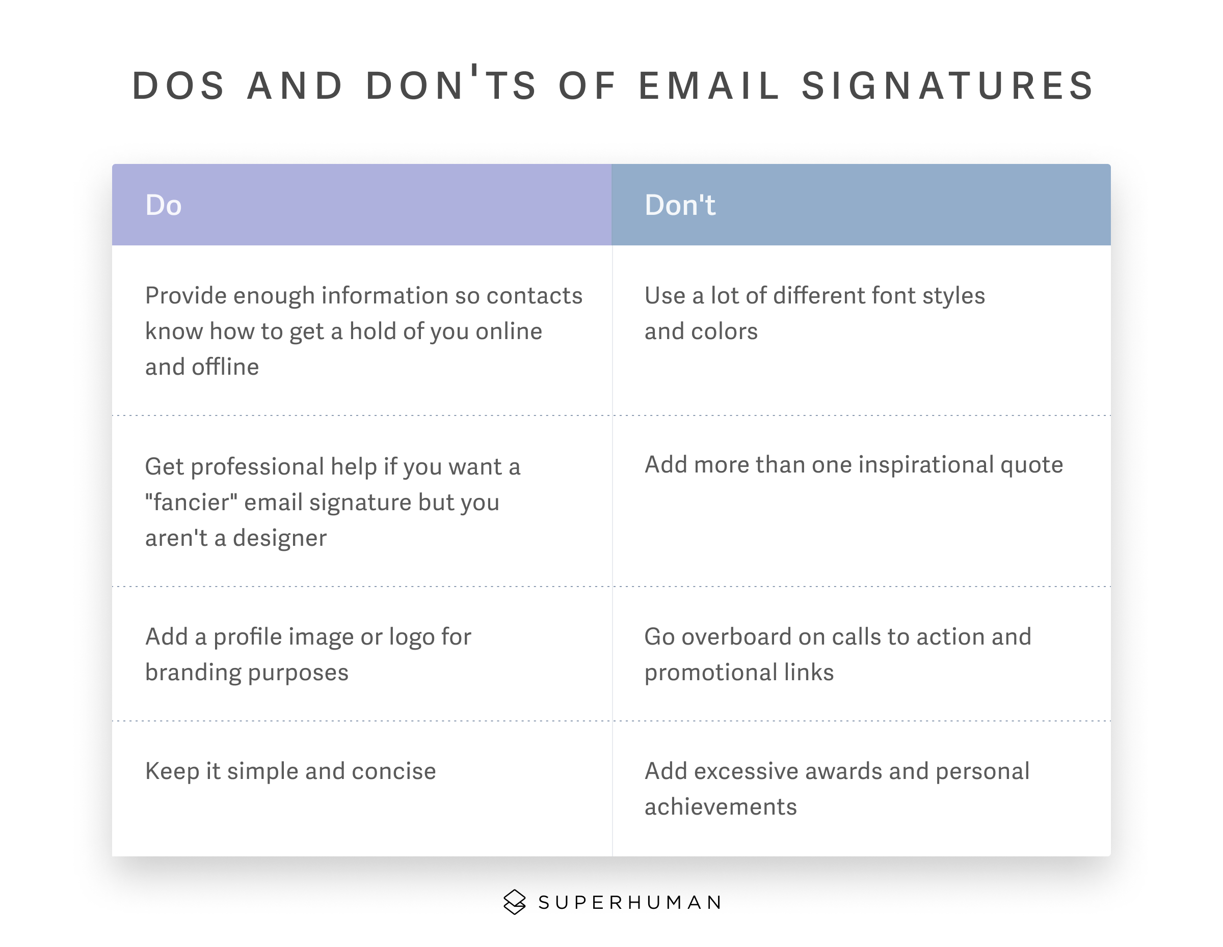
So we talked about the hidden messages your email signature might be broadcasting and how to craft the perfect email signature. Here's a handy chart to summarize…

Don't get fancy — get faster
Email is a time suck, especially if you're juggling multiple responsibilities throughout your day. Plus, inefficient email management can hinder productivity and make your mind feel as cluttered as your inbox.
Superhuman speeds up email management, saving you at least 3 hours a week. Get control of your inbox and your time, and discover the benefits of automating repetitive email workflows!
Superhuman is also a little bit fancy… well, in a serene and elegant kind of way. Just look at the amazing visuals Superhuman rewards you with when you reach Inbox Zero.
If you thought Inbox Zero was a pipe dream, you haven't tried Superhuman.
Sign up for Superhuman today and get in control of your email inbox.
Get started with Superhuman


