Images wield incredible power.
Chosen with care, images can alter your mood, transform your product experience, and even reinforce habits and workflows.
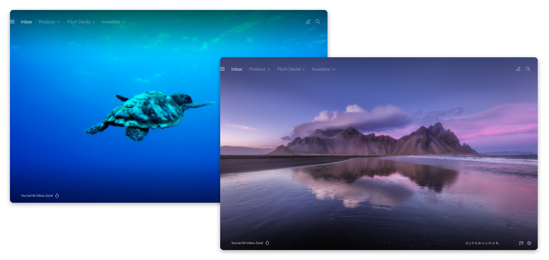
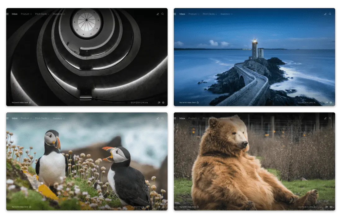
That's why Superhuman Mail, the fastest email experience on earth, rewards you with stunning imagery when you hit Inbox Zero! With keyboard shortcuts, you can quickly triage messages, reply to email, set reminders, bulk archive… then bam! Your inbox is off to a fresh start. Will you be transported to seascapes in Indonesia or mountains in Iceland? Fly through your inbox for the big reveal!

Over time, we've honed our playbook for choosing images that not only evoke powerful emotions but reinforce good habits.
Here's how we decide what makes the cut — and how to apply it to your product.
How to find images that evoke powerful emotions
Consider these 3 requirements when sourcing images: carefully chosen subjects, a sense of immersion, and technical perfection.
1. Be intentional about subject choices
At Superhuman, we choose Inbox Zero images that reward our users with joy and surprise — exemplifying our principles of game design. This encodes emotion into our users' email habits, making new workflows more memorable and easier to learn.
To create ever-changing rewards, we choose photographs that span a variety of subjects: from architecture, through wildlife, to landscapes.

This is how to choose powerful images for every subject:
- Architecture: Focus on artistic compositions and striking textural differences. Be as inclusive as possible; avoid buildings or symbols with religious connotations.
- Wildlife: Look for images that evoke positive feelings of mystery, majesty, and playfulness. At Superhuman, we also introduce elements of surprise by choosing fun outliers! Who doesn't love a lazy bear?
- Landscapes: Pick wide shots that set the context, where you can see into the distance or focus on a vanishing point. (More on the power of immersive landscapes in the next section!)
2. Find powerfully immersive images
To evoke strong emotions, photographs must create feelings of immersion. Users must be able to easily imagine themselves in the scene.
Here's what to look for:
- Distance. Transport the viewer to another place with wide shots that set context.
- Layering. Draw viewers into the scene by picking images with a sense of depth.
- Novelty of viewpoint. Heighten the viewer's sense of discovery by choosing unusual angles and vantage points.
- Rarity of color. Amplify feelings of surprise and delight by selecting images with unusual hues.
- Original compositions. Avoid clichés, like overused landscapes or latte art! While they're beautiful on social media, these compositions are too commonplace to elicit strong emotions.
- Minimal use of people. Use human subjects sparingly (or keep them tiny relative to the rest of the scene). It's harder to immerse ourselves in a photograph if we find the subject unrelatable, so human faces sometimes hinder our imagination.
Consider the 2 mountain shots of Banff below — which one creates a sense of novelty and immersion, and ultimately evokes a stronger emotion for you?

• Medium distance
• 2 main layers
• Ground-level viewpoint — you could hike here
• Crisp details throughout the image
• Vivid colors, but a typical overcast day
• Far distance
• 3-4 layers
• Lofty viewpoint — you'd need a helicopter ride!
• Crisp details offset by misty sky
• Ethereal blues and dramatic early-morning light
3. Seek technical perfection
Of course, you want to use photographs of the highest quality!
But how can you determine that quality — and quickly? By assessing technical quality and artistic composition.
How to assess remarkable image quality
First, aim for an image resolution that is at least twice the size of your product, so that it will look sharp on retina screens.
Next, pick a focal point! If there are any subjects in your photos, make sure their eyes are in focus. We instinctively gravitate towards eyes in photographs, so this is the fastest way for someone to tell if a photo is crisply shot! (It's common for animal photography to have slightly blurry eyes because the animals are in motion.)
Lastly, choose photos that look natural and not overly produced: that is, photos with HDR effects or strong image filters. Avoid overly vibrant saturation and colors that appear as though they have another hue overlaid on top.
How to gauge exceptional composition
Look for compositions that use the rule of thirds.
Imagine a 3x3 grid overlaid on top of an image — photos with subjects positioned at the intersecting points, or along the vertical or horizontal lines, are generally more compelling. The tension from the asymmetrical composition adds visual interest to otherwise balanced scenery.
Ensure that subjects face toward the center of the image. This keeps the user grounded within the product and ensures their gaze isn't diverted elsewhere.
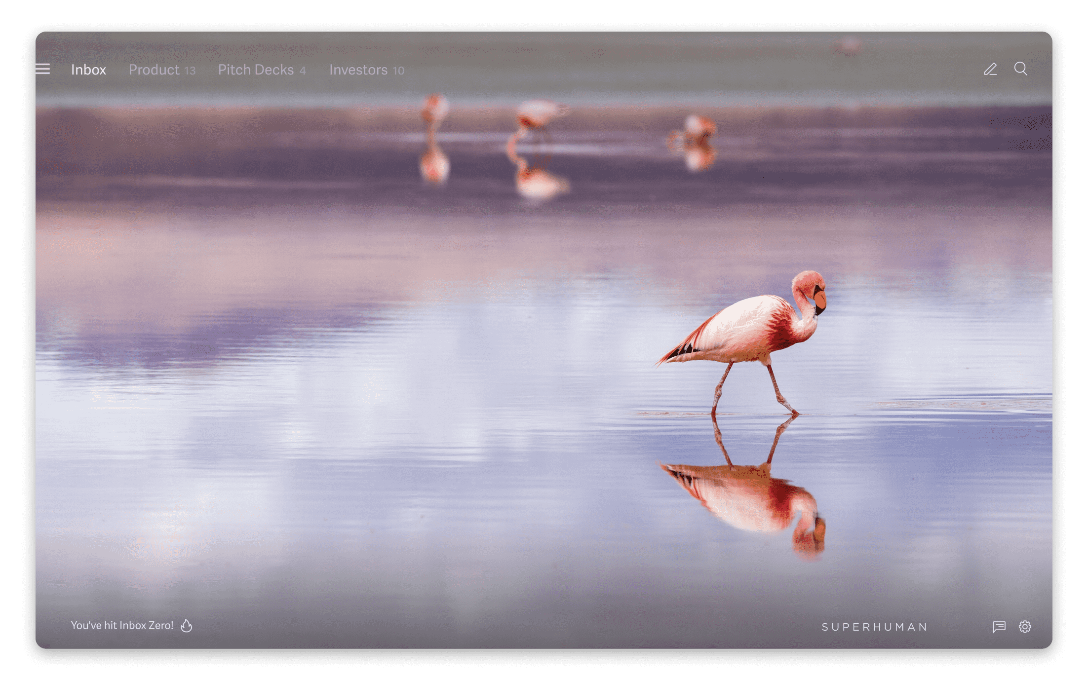
As such, we would never choose a photo where animals are walking off center stage — notice the difference when this flamingo struts toward the edge of the frame!

Just as importantly, ensure that there is a point of focus in the image — and that it is not too abstract or overwhelming in texture. While abstract photographs can be visually beautiful, it's disorientating if the viewer can't discern what the image represents, or where to look.
Finally, avoid compositions that seem impossible — or which have been stitched together in post-production.
How to bring extra delight to your images
After picking the perfect photographs, there are plenty of opportunities to add even more delight to your product experience! Follow these 3 rules for thoughtful editing, perfect placement, and a sprinkling of surprise…
Rule #1: Even exceptional images need meticulous editing
Remarkable images still require fine-tuning. Straighten landscape shots with off-kilter horizons, and remove any jarring elements — like blood on a playful pair of foxes!
Unsplash is a wonderful image library where photographs are shared, for free, by a community of 200,000 hobbyists and professional photographers. The work is licensed such that anyone has full creative liberty to modify the image, giving you the flexibility to make finishing touches.
Rule #2: Every image must be tailored to the product
How your photos show up in your product makes a big difference.
At Superhuman, we take extra steps when implementing our Inbox Zero photographs:
- Make sure images always show up as intended.
Example: At Superhuman Mail, we implemented custom centers for each photo. When the app window is resized, images with subjects (like animals) that are not in the center of the frame will still appear.
How to apply: Test your images within different UI themes (if applicable) and across all screen sizes and platforms to make sure it looks right in all scenarios. Consider implementing custom centering for images that may be cropped differently at various screen sizes. - Ensure any text on top of the images is legible.
Example: We overlay our inbox splits titles on top of our Inbox Zero photos. To make sure this text is readable over images of varying brightness, we developed custom scrims that we can manually set for each photo.
How to apply: Test your images with different copy to ensure content of different lengths will still be readable when paired with your imagery. To ensure text is well integrated with your photos, consider implementing custom scrims! - Think about the interplay between your imagery and product experience.
Example: In Superhuman Mail for iOS, we hide our user interface chrome when you hit Inbox Zero, so that users can fully immerse themselves in the photo. This augments the element of surprise when users triage their email on their iPhones or iPads!
How to apply: Think about how images show up in your product: how do they transition from screen to screen? What happens when images are loading? Consider hiding your user interface, and showcasing your images full-bleed.
Rule #3: Incorporate elements of pleasant surprise
The experience of fun can be defined as "pleasant surprise" — we can therefore make our products feel fun by deliberately including moments of pleasant surprise.
As Superhuman Mail users experience Inbox Zero on their first, tenth, or 100th day, we're always looking for new ways to introduce elements of surprise. Every year we make subtle nods to special occasions like Earth Day, Pride, and our latest addition, National Dog Day!
Today's Inbox Zero photo is dedicated to the pups of Superhuman, who increase our productivity by:
— Superhuman (@Superhuman) August 26, 2021
✔️ Ensuring regular breaks
✔️ Providing moral support
✔️ Brightening up meetings
(Meet them here: https://t.co/nVfzdGS9bT 🐶)#InternationalDogDay pic.twitter.com/iPPz1URAAW
To many users, it's simply another beautiful image; but some will feel the thrill of recognition as they connect the image and event.
Inbox Zero images: our framework for joy and delight
To drive home the emotions of joy and delight, consider how you can innovate upon the use of photography in your product.
Start by finding images that are immersive, technically well-photographed, and feature an emotionally resonant subject.
Use these images thoughtfully: make edits, test them with your product environment, and consider ways to amplify the viewer's delight.
With these rules in mind, your product experience will be taken to the next level — with imagery that is powerful, emotive, and transformative! If you have any thoughts or questions, let's chat! @ifbirdsfly


