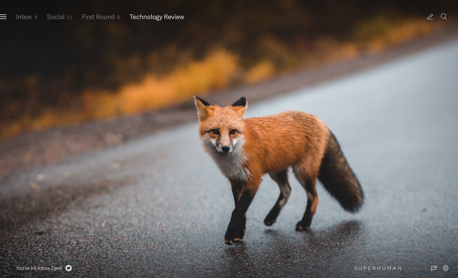
At Superhuman, we set out to build the fastest email experience in the world.
And, although our work is never done — more on this below! — we did exactly that.
Our users now get through their inboxes twice as fast, reply to important messages sooner, and save three hours or more every single week. If you’re not yet a user, this may be hard to believe — just check out our Wall of Love.
On desktop, we did this with blazingly fast software, keyboard shortcuts for everything, and features like Snippets, Remind Me, and Split Inbox.
On mobile, we also built blazingly fast software and novel ways of working. But instead of keyboard shortcuts, we built faster gestures. In other apps, going back to your inbox requires a long reach and often an edge swipe. In Superhuman Mail, you can swipe anywhere on the screen. In other apps, switching folders requires an extreme reach to the top left of your phone. In Superhuman Mail, you just tap the bottom of the screen.
However, despite these innovations, some gestures missed the mark. It was hard to reply or forward previous messages in a conversation; you had to long-press. This is slow, hard to discover, and not well known beyond early adopters. It was hard to select text; you had to extra-long-press. This is even slower, very hard to discover, and not well known at all!
We have now comprehensively redesigned all our gestures. Interacting with messages is much faster and easier, as is selecting text. Let’s jump right in…
In conversations
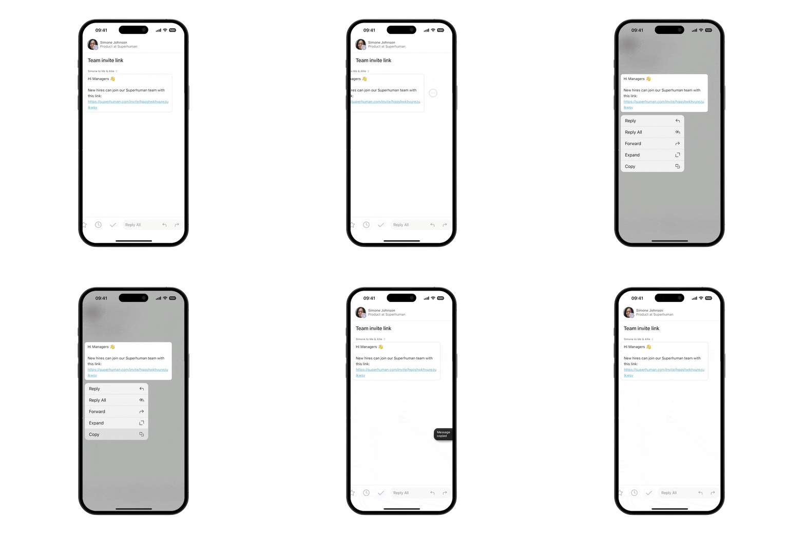
To reply, forward, and take action on a message, just swipe. No need to long-press.
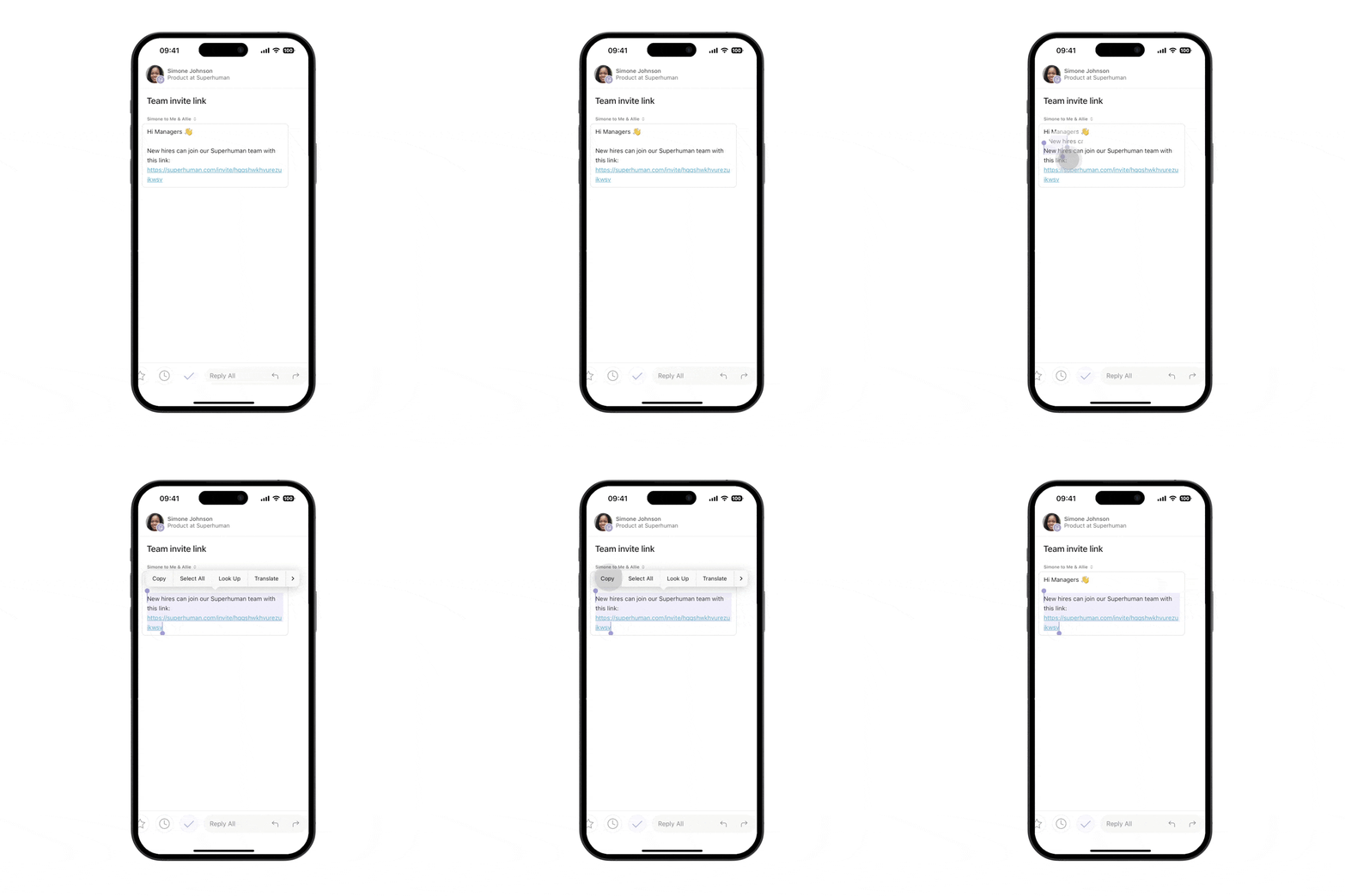
To select text, just long-press. No need to extra-long-press.
To make room for these gestures, pulling left no longer reveals times. Times are now in message headers — just tap to see them.
In the inbox
To manually refresh, pull down and swipe left. Superhuman Mail always keeps your inbox up to date, but sometimes you just have to be sure.
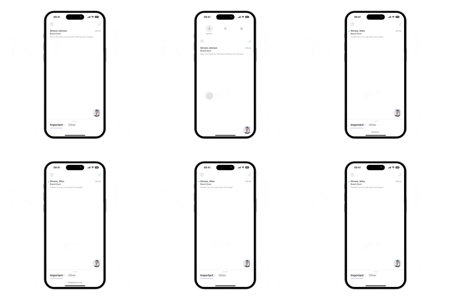
To search, just pull straight down. As before, search stays right at your fingertips.

To open Superhuman Command, pull down and swipe to the right. From here, you can do anything.
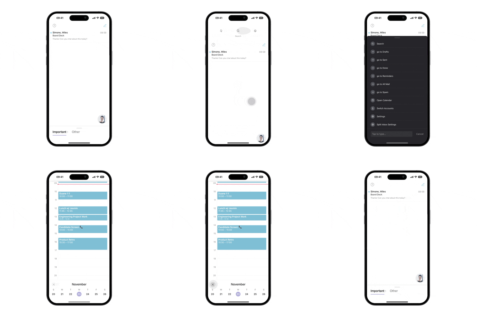
We also improved Superhuman Command itself. It previously had two columns, low contrast, and a stylized font. Now it has one column, high contrast, and a simpler font. These changes make it faster and easier for you to do what you want.
On change
Before we wrap, I’d like to share a quick thought on change. It can be hard to learn new interactions, even when they are better. I myself was pulling left to see times for weeks into our testing. But as I often say to the team: we need to give change a chance to settle in. We did just that, and have tested these changes for months. I am excited to share that Superhuman Mail is now faster and easier to use than ever before!
As always, I’d love to hear your thoughts. Find me at rahul@superhuman.com or at @rahulvohra 🙏


