How to design delightful dark themes
When done well, dark themes have many benefits. But it's difficult to create them. Here's how we did it at Superhuman Mail, the fastest email experience on earth.

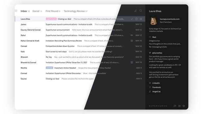
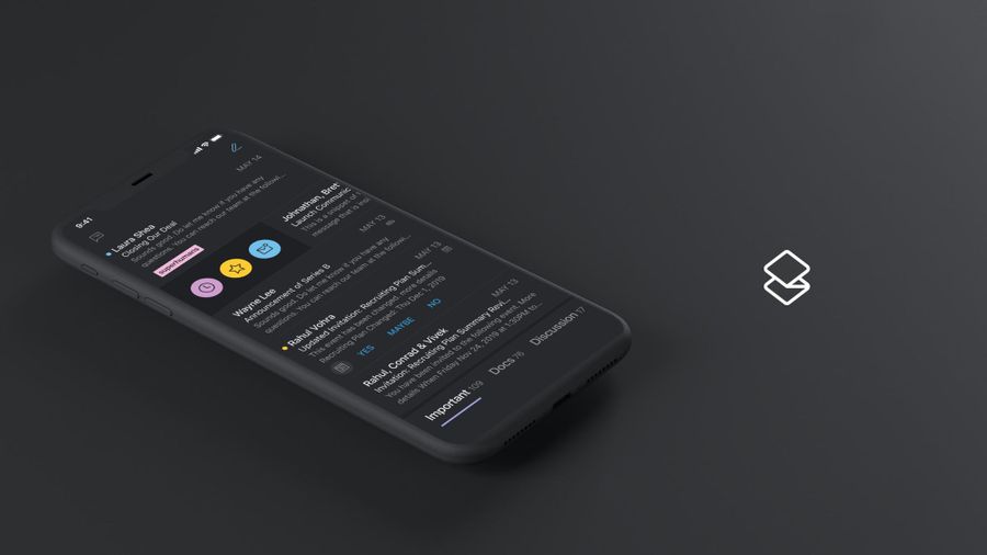
At Superhuman, we're building the fastest email experience in the world. Get through your inbox twice as fast as before, and sustain inbox zero!
Dark themes are the latest trend in app design. macOS introduced Dark Mode last year. Android launched Dark theme last month. iOS caught up in the last two weeks.
Once rare, dark themes have become widely expected.
When done well, dark themes have many benefits. They reduce eyestrain. They are easier to read in low light and improve reading speed. And, depending on the screen, they can greatly reduce battery consumption.
However, it is difficult to create a delightful dark theme. We cannot simply reuse our colors or invert our shades. If we do, we will achieve the opposite of what we want: we will increase eyestrain and make it harder to read in low light. We may even break our information hierarchy.
In this post, we share how to design dark themes that are readable, balanced, and delightful.
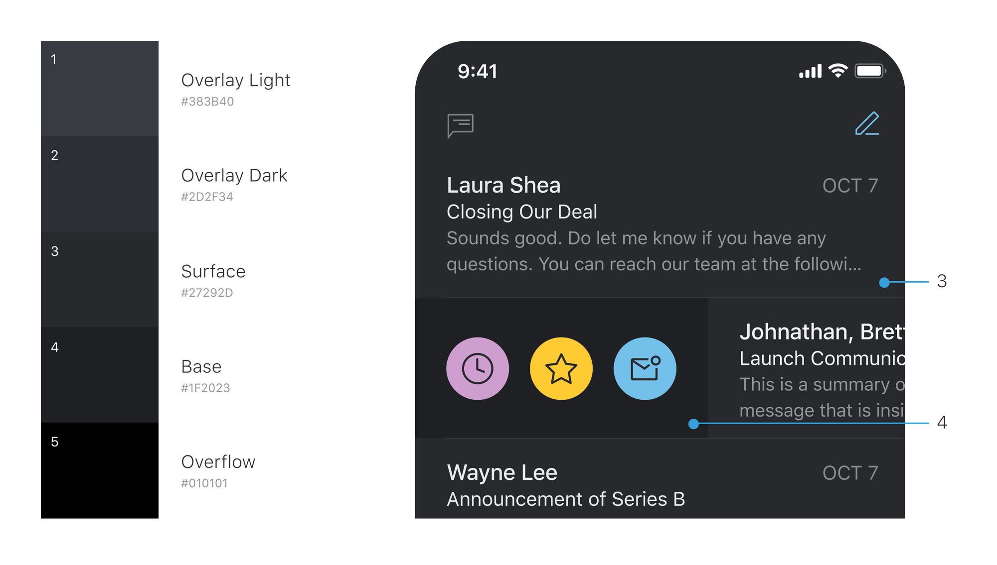
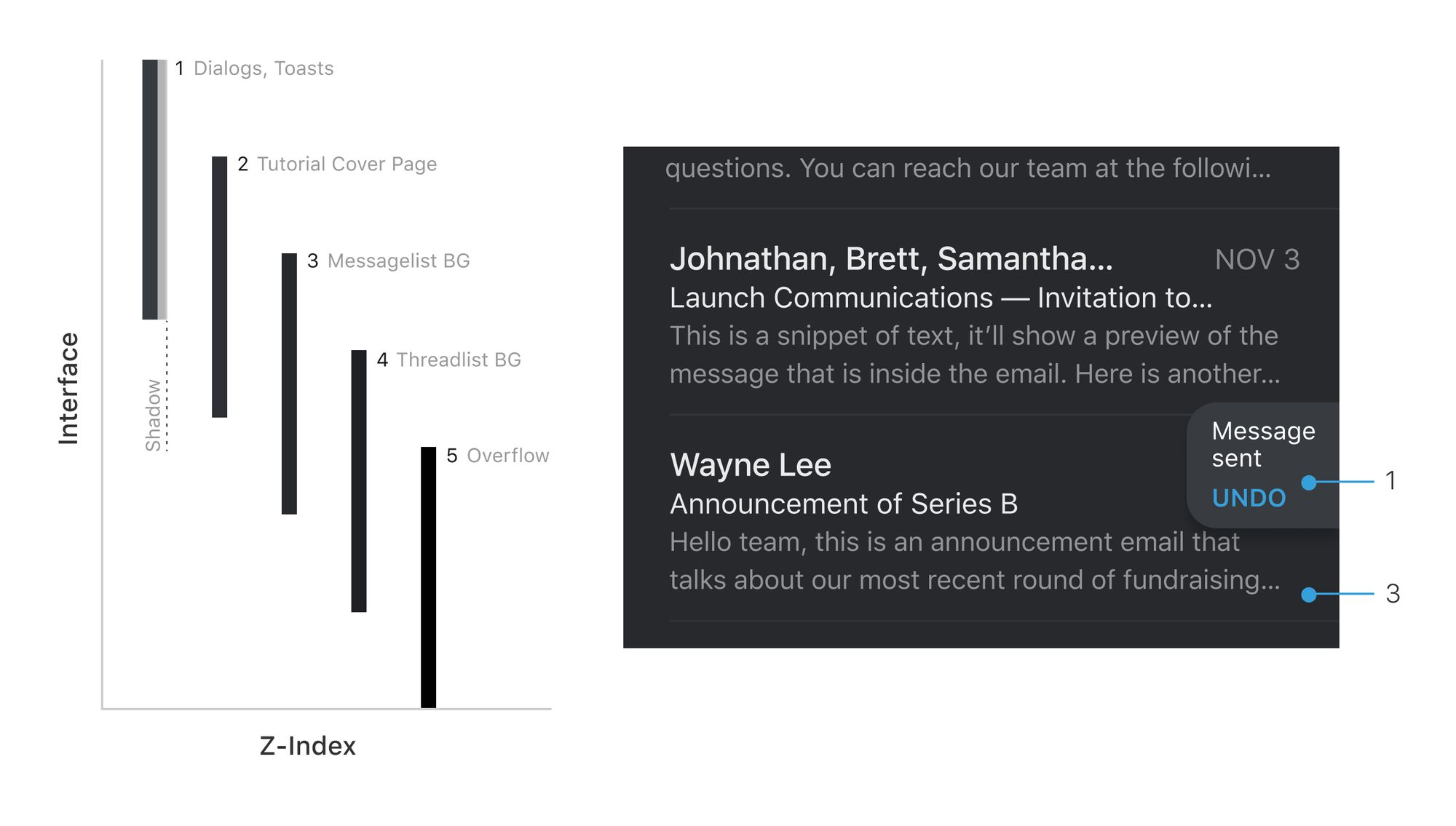
1. Darken distant surfaces
In dark themes, background colours for UI elements follow one guiding principle: the closer the layer is to the user (e.g. modals), the lighter the surface area. This model is analogous to an environment in which a light source is cast from above. The further behind a layer, the less light it receives and the more it recedes into the background.
When creating a dark theme, it can be tempting to invert an existing light theme. However, distant surfaces would become light and near surfaces would become dark. This would break physicality and feel unnatural.
Instead, take only the main surface color of your light theme. Invert this color to produce the main surface color of your dark theme. Lighten this color for nearer surfaces, and darken this color for distant surfaces.
In Superhuman Mail, our dark theme is made of five shades of gray. Nearer surfaces use lighter grays; more distant surfaces use the darker grays.
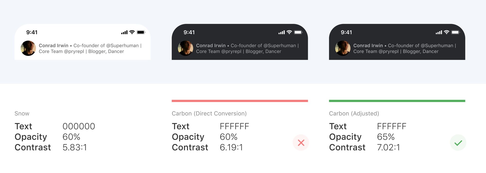
2. Revisit perceptual contrast
When designing a dark theme by referring to a light theme, it is important to revisit perceptual contrast. This is how much contrast an element appears to have, regardless of what the numbers may suggest.
For example, in our light theme, contact details are black with an opacity of 60%. But in our dark theme, we set contact details to white with an opacity of 65%. While both contrast ratios exceed AA standard, the extra 5% prevents fatigue, especially in low light conditions.
There is no hard rule for these offsets. Instead, we adjust each item individually — considering text size, font weight, and line width — to ensure that the dark theme is as clear and as easy to read as the light theme.
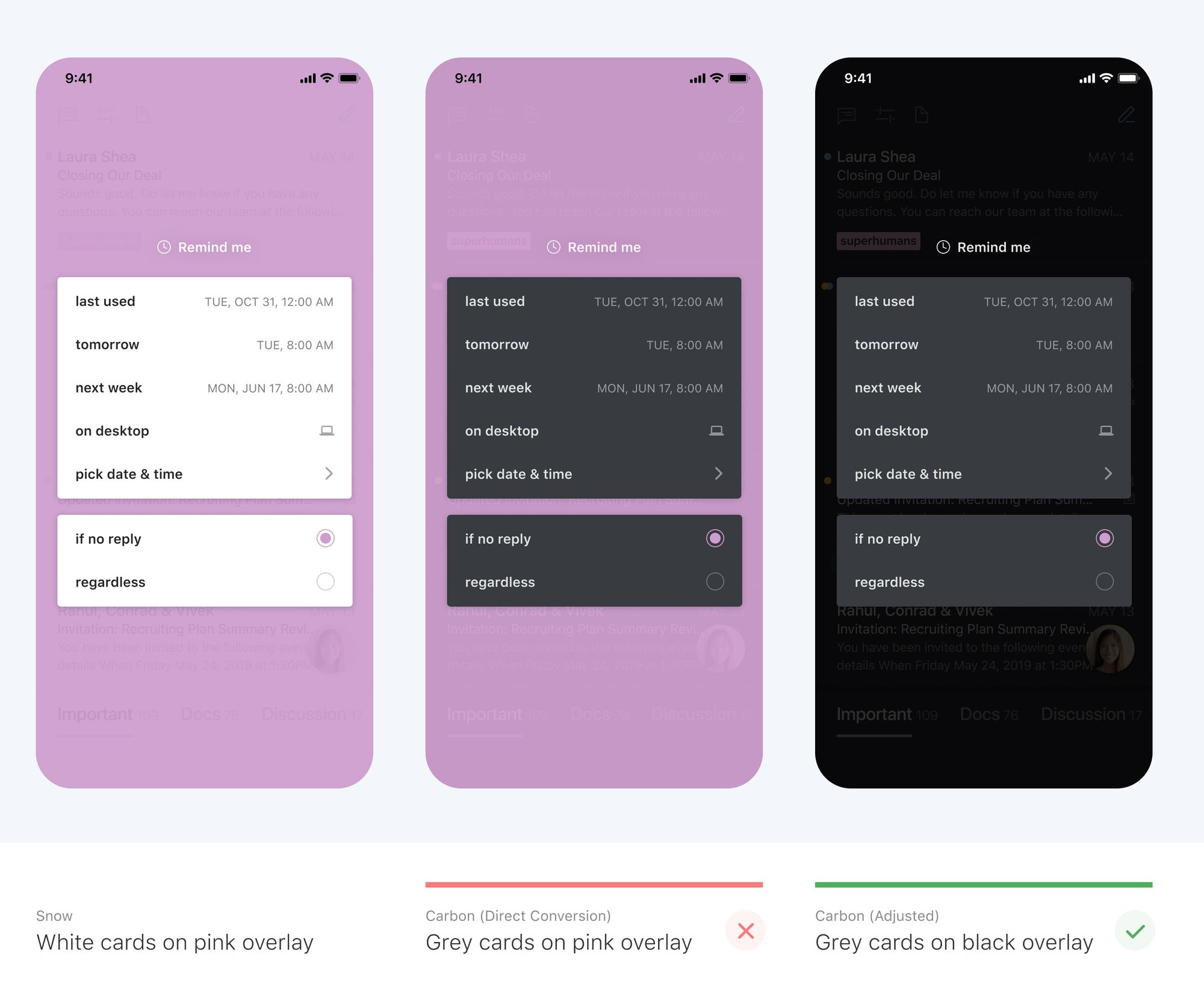
3. Reduce large blocks of bright color
In light themes, we often use large blocks of bright color. This is usually fine: our most important elements are likely to be brighter still. But in dark themes, it does not work: large blocks of color pull focus from our most important elements.
For example, consider our Remind me screen. In our light theme, the pink overlay does not distract from the even brighter dialog. But in our dark theme, the same overlay pulls our attention away. We removed the overlay altogether so that it is fast and easy to focus on what matters.
4. Avoid pure black or white
In Superhuman Mail, we do not use any pure black or white in our dark themes. Here are four reasons to do the same.
4.1. Realism
True black does not exist in our daily environment. (The darkest object in the world, a yet-to-be-named material developed at MIT, is still 0.005% shy of true black!) Our vision has therefore adapted to perceive relative darkness as true black. This is why #000000 can feel so jarring, especially when set against lighter elements. It does not match anything we normally see.
4.2. Black smearing
Black smearing is a visual distortion that occurs when lighter content is dragged or scrolled across pure black backgrounds.
This effect occurs on OLED screens, which are increasingly common. On these screens, pure black pixels are turned off. (This is how dark themes can use less energy than light themes.) However, it is slower for these pixels to turn on and off than to change colors. This variable response creates the smearing effect.
You can avoid black smearing by using dark gray, as then pixels will not turn off. This even works with a gray as dark as #010101 — and still uses much less energy than a light theme!
4.3. Depth
If you use true black in background elements, you lose certain techniques to convey depth.
For example, imagine your background is pure black. On top of this, you show a notification. The notification should float above the background, so you use a shadow to convey depth. Except the shadow is imperceptible, as nothing is darker than pure black.
If your background is not pure black, you can use shadows with different opacities and blur to convey depth. For example, consider the notification in Superhuman Mail:
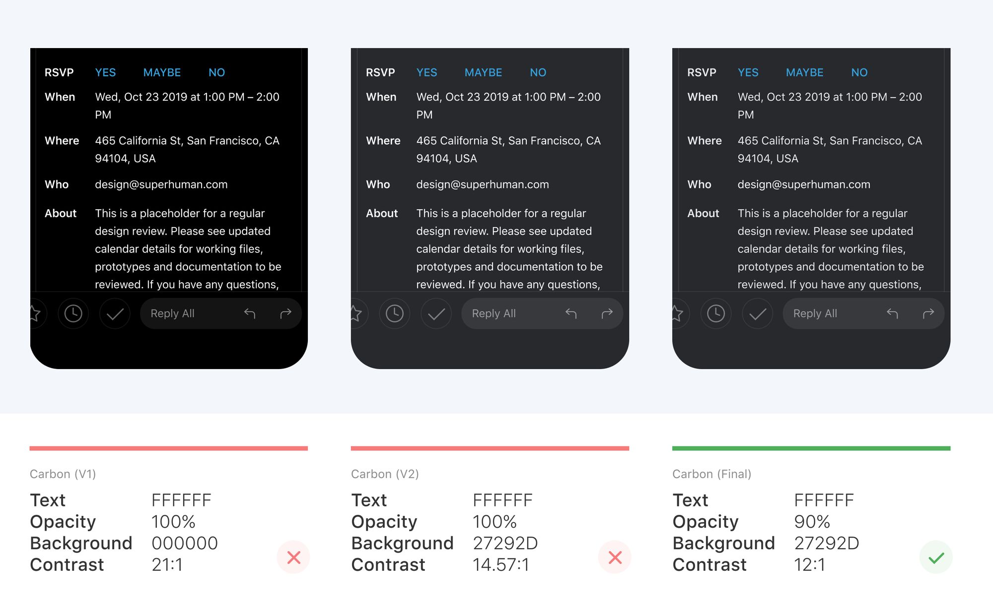
4.4. Halation
Pure white text against a pure black background produces the highest contrast possible: 21:1. In quantitative WCAG accessibility terms, this is the dream output.
However, when designing dark themes, it's important to be mindful of contrast ratios that are exceedingly high. Contrast that is too high can cause eye fatigue and halation. If you use dark mode on Gmail, you'll likely experience eyestrain.
When very bright text is set against a very dark background, the text can appear to bleed into the background. This effect is even stronger for those of us with astigmatism. According to Jason Harrison, Post Doctoral Fellow from Sensory Perception and Interaction Research Group:
People with astigmatism (approximately 50% of the population) find it harder to read white text on black than black text on white. Part of this has to do with light levels: with a bright display (white background) the iris closes a bit more, decreasing the effect of the "deformed" lens; with a dark display (black background) the iris opens to receive more light and the deformation of the lens creates a much fuzzier focus at the eye.
In Superhuman Mail, we have to be particularly careful about halation, as our app is very text heavy. We set our white text to 90% opacity so that the dark background blends through. This balances contrast and brightness so that the app is easy to read in a wide variety of light conditions.
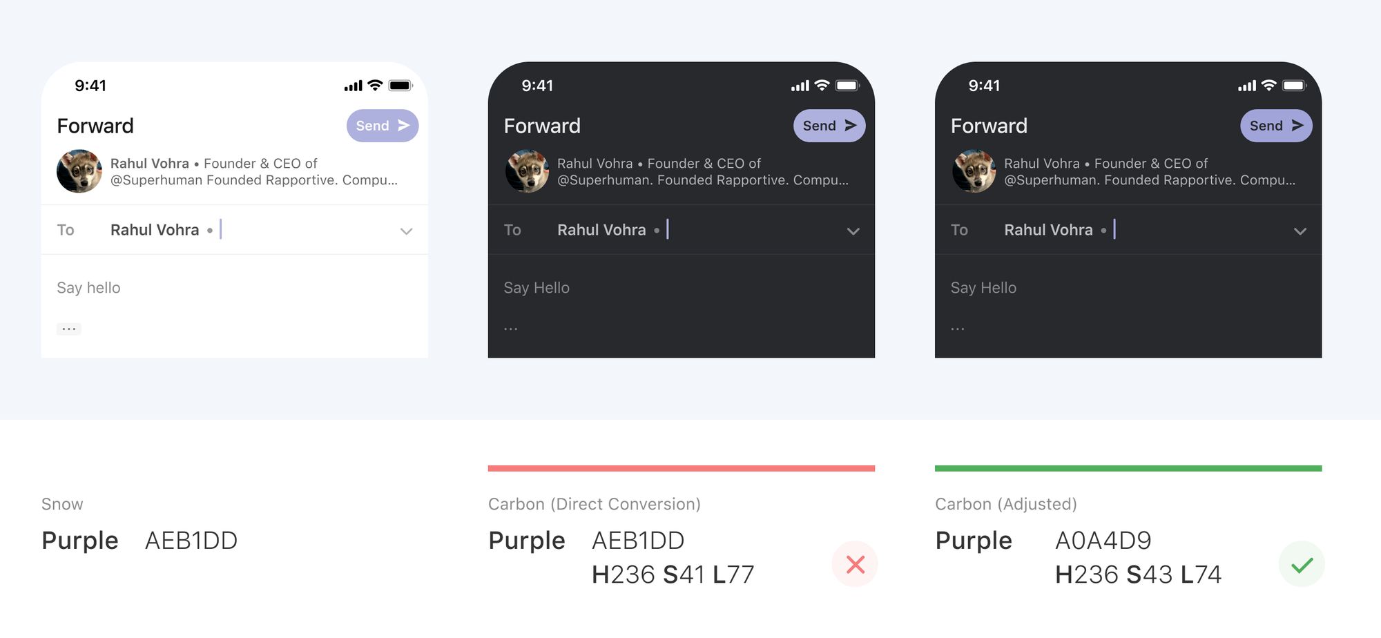
5. Deepen colors
Since we toned down our text to avoid eye fatigue and halation, our colored accents and buttons may appear too bright. We now have to adjust these colors to work better in a dark theme. First, we reduce lightness so these colors do not overpower nearby text. Second, we increase saturation so they still have character.
For example, if we directly use the purple from our light theme, it appears too bright against nearby text. In our actual dark theme, we deepen this color so that users can focus on the text.
Conclusion
Dark themes have many benefits and are now widely expected. However, they are difficult to execute well. The simple approach of reusing colors and inverting shades will increase eyestrain, make it harder to read in low light, and may even break visual and information hierarchy.
We found a systematic way to build dark themes that are readable, balanced, and delightful. Just follow these steps:
- Darken distant surfaces
- Revisit perceptual contrast
- Reduce large blocks of bright color
- Avoid pure black or white
- Deepen colors
I hope this helps you design delightful dark themes. If you have any thoughts or questions, let's chat! @ifbirdsfly 👩🎨