We redesigned Superhuman Mail for iOS and Android 📱
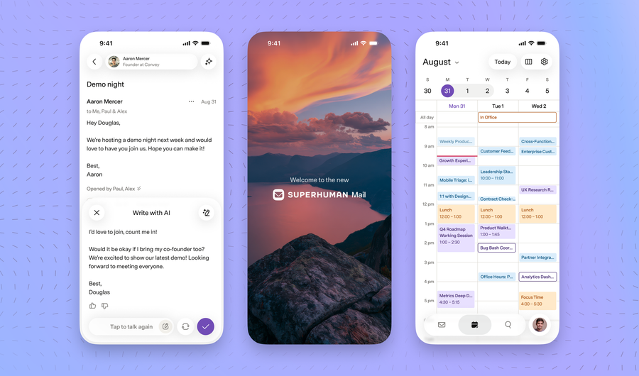

When we started Superhuman Mail, we set out to build the most productive email app ever made.
Over the years, people fell in love with our web and desktop apps. Check out our Wall of Love! But we also know that our mobile apps have not yet reached that bar.
So we spoke with thousands of you — thank you so much! — digging deep into what you love and where you get stuck.
Today, I am thrilled to introduce the biggest mobile update we've ever made: a complete, soup-to-nuts, top-to-bottom redesign of our mobile apps.
We have redesigned our apps around four key principles…
1. Everything important is one tap away
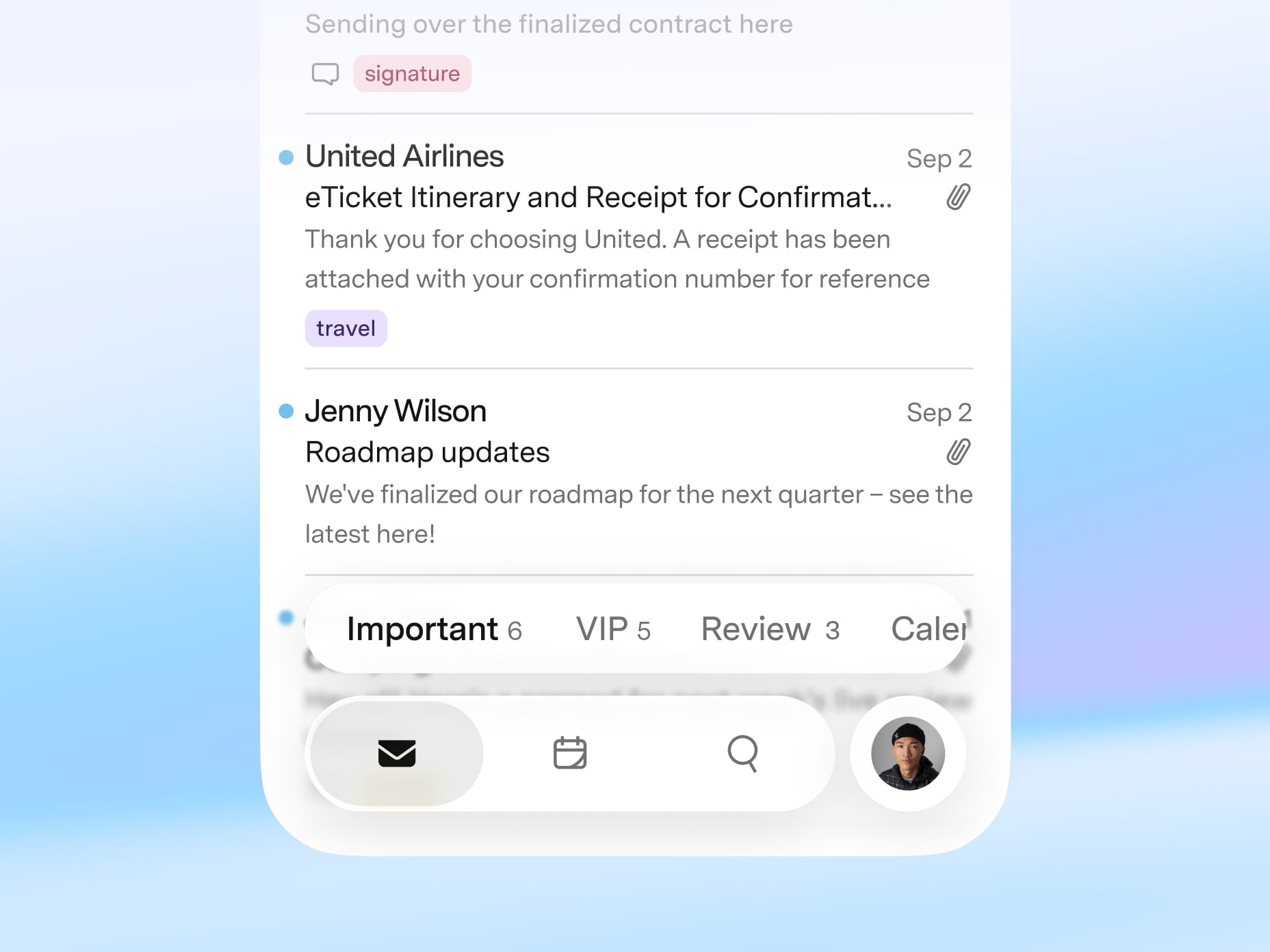
In the old design, it was hard to get to key parts of the app. Calendar was a tiny icon in the top left of the screen, and the only way to search was to pull down on the inbox.
In the new design, we have persistent navigation at the bottom of the screen so you can switch instantly between your inbox, calendar, and search.
We've also grouped together Recent Opens and Ask AI, making them easier to find and easier to use.
2. Writing that feels effortless
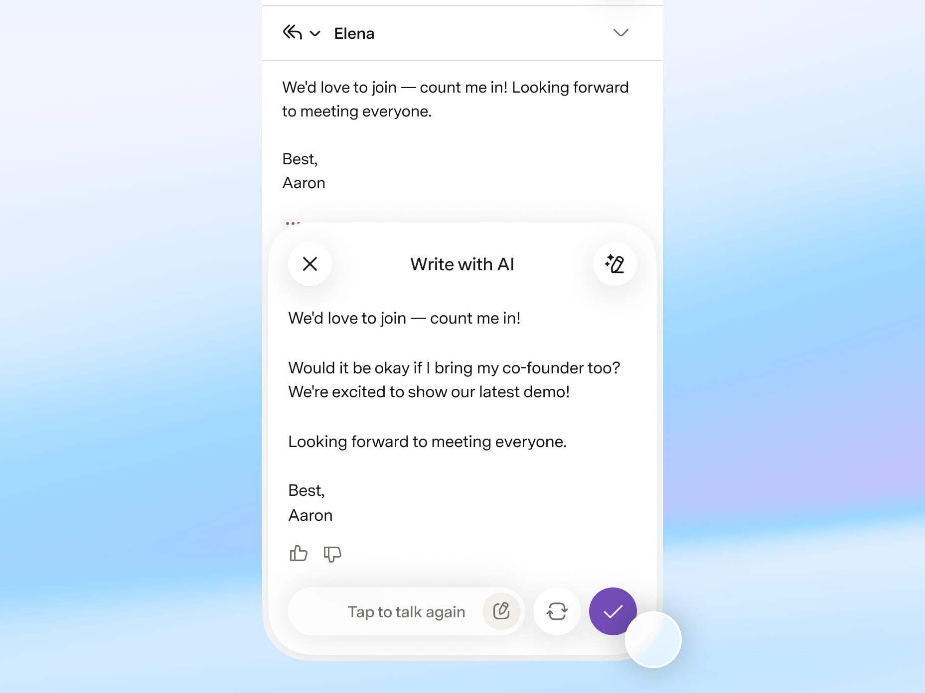
In the old design, we had one experience for writing a new email and a completely different experience for replying to an email.
In the new design, they’re the same — and they’re fast, minimal, and beautiful. Remind Me, Send Later, and Snippets are all just a tap away.
We also invested heavily in our writing features. We built a dedicated experience for Auto Drafts, and we made Write with AI and Write with Voice twice as fast. You can now write at the speed of thought.
3. Interactions are fast and intuitive
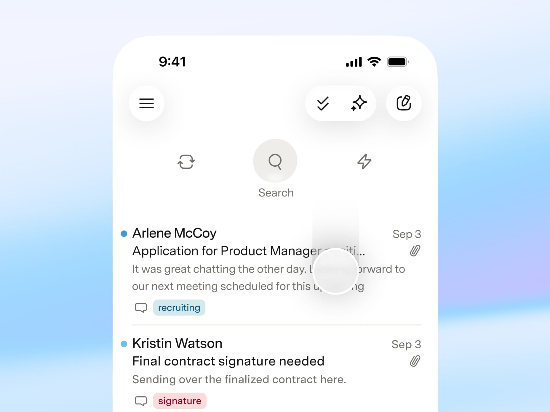
In the old design, certain things were hard to do. To discard a draft, you had to pull down. To reply to an earlier message, you had to swipe right. These actions were fast once you knew them, but weren’t easy to find.
In the new design, those actions are now fast and easy to find.
In the old design, certain things were confusing. For example, comments looked too much like emails.
In the new design, comments and emails look very different. It’s now obvious when you’re talking to your team or your contacts.
We’ve also kept the interactions that are uniquely Superhuman. Consider most email apps: to search, you need to reach for a tiny icon; to switch accounts, you need to navigate a menu; to get back to the inbox, you have to reach for a distant back button or swipe from the edge of the screen.
In our new apps, we’ve kept these core actions super fast. To search, just pull down anywhere on your inbox. To switch accounts, just tap your profile photo. To get back to the inbox, just swipe anywhere on the screen.
And finally, we’ve added a few new shortcuts. To get back to Inbox or Important, just tap the Mail icon at the bottom of the screen.
4. Beautiful on every device
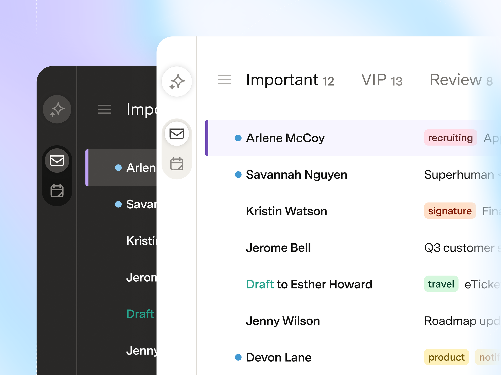
Our new apps embrace Liquid Glass on iOS and Material 3 on Android. They also sport larger fonts, higher contrast, warmer colors, and much improved readability.
We’ve also updated our web and desktop apps to have new matching themes. Like our new mobile apps, these themes have higher contrast, warmer colors, and improved readability. To change themes, hit Cmd+K (Mac) or Ctrl+K (Windows) → Theme Settings.
Across the board, we are introducing our new Superhuman Mail logo. As we build our suite, this brings Mail, Docs, and Go together into one family of connected products. We’ll share more on this front soon.
What folks are saying
Thank you so much to everybody who helped test and refine these new designs! The early feedback was overwhelmingly positive:
"I've loved using the new mobile app and can’t wait for everyone else to be able to."
"The visual upgrades were on point and it felt like a leap in usability for me. As strange as it sounds, I would say that it was fun to use."
"The Superhuman Mail Android mobile update is SO GOOD!!! Wowowow, and the calendar feels top notch too! Well done team! 🔥"
"The new mobile app is incredible, and I just updated to the new theme settings on my Mac as well. Honored and grateful to have early access ❤️ … It's beautiful."
"I'm a real fan of what you've built. You breathed new life into email for me. Before Superhuman, I hated working with mail clients. Now, I actually enjoy it. That’s a rare thing to say about email. Thank you for reinventing it."
"The new app feels fast, readability is noticeably better, the links to drafts are great, and the bottom navigation bar for mail, calendar and search makes a lot more sense. The new theme is subtle on my PC but makes a big difference in how emails look. I…love…it!"
What's next
This redesign is just the beginning. Next up:
- We’re rewriting the email engine itself, which will massively improve search and make the app significantly faster.
- We're connecting Auto Drafts to the apps and tools you already use, so your drafts have more context.
- We're building a full voice mode, so you can drive your inbox completely hands-free.
Get started
Update to the latest version and try it out.
We can't wait to hear what you think!
Onwards 🚀
Rahul