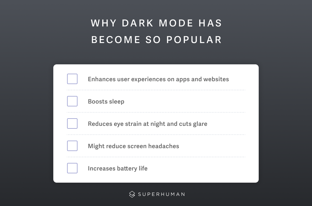
Spending late nights battling eye strain while clearing your inbox? Dark mode might help, but only in the right conditions. One-third of people prefer dark mode exclusively, another third prefer light mode, and the remaining third switch based on context.
Whether the benefits of dark mode improve your experience depends on several factors: your environment's lighting, your eye characteristics, your device's display technology, and the task you're performing. Here's what the latest peer-reviewed research reveals about when dark mode actually improves productivity and when it hurts.
What is dark mode, and where did it come from?
Think about most websites and applications. These sites typically use darker text displayed against a lighter or white background. Most of us are familiar with this dark on white combination when browsing the web or our mobile devices. Before computers, we also wrote with our black pens on white paper and read books with dark text on a light background. It's what we're used to.
But then, dark mode shattered the norm.
Dark mode swaps the standard color schemes on computers and device screens from lighter backgrounds to darker backgrounds. Instead of dark font on a white or light background, dark mode displays a lighter font on a darker background.
Dark mode has become increasingly prevalent across major platforms. Google products, including Gmail, YouTube, and Photo,s offer dark mode options. Microsoft introduced dark-themed elements in Windows Phone 7 in 2010. Today, major technology companies include dark mode as a standard feature across their applications and services.
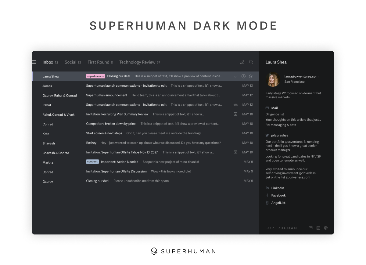
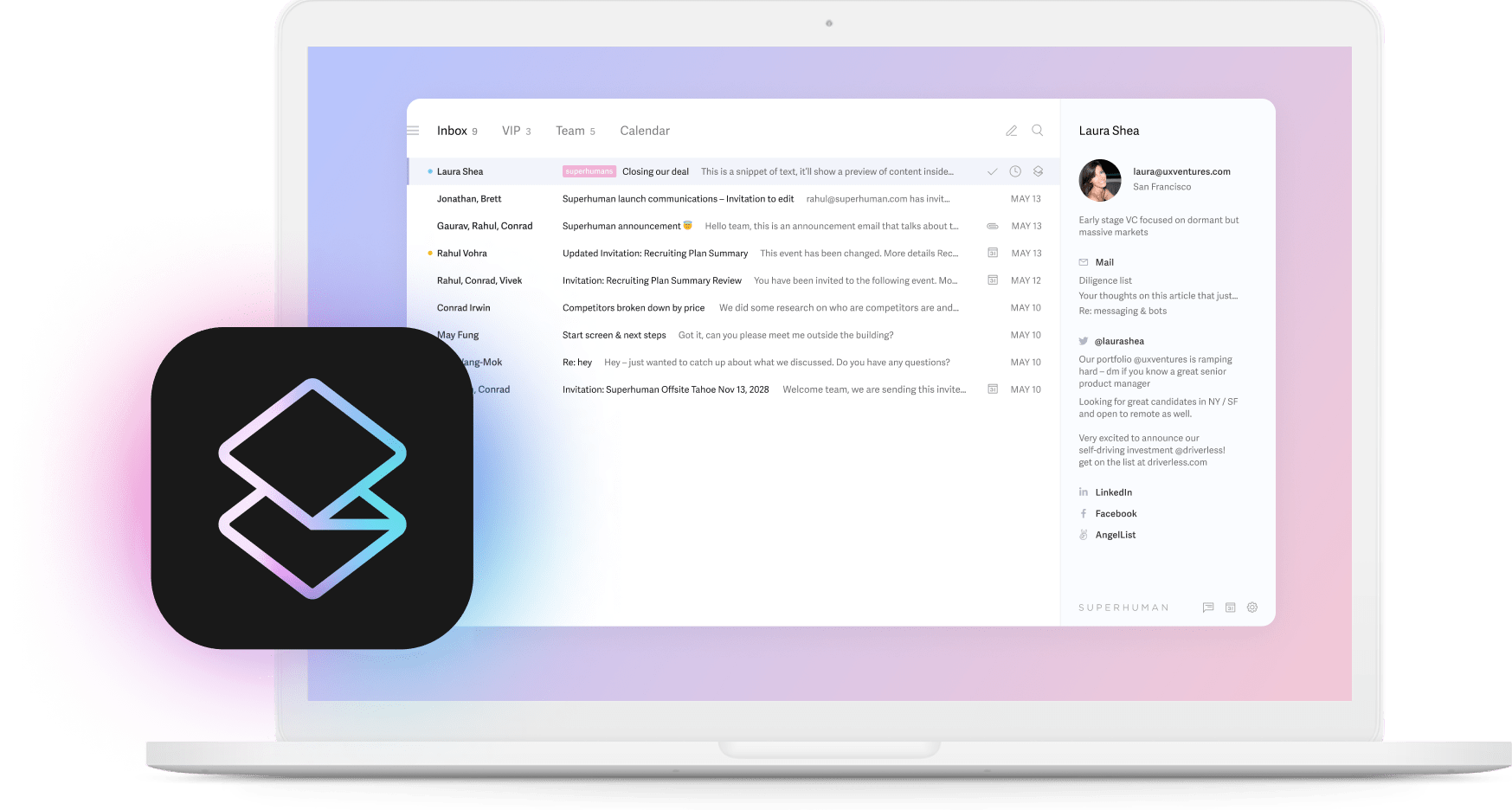
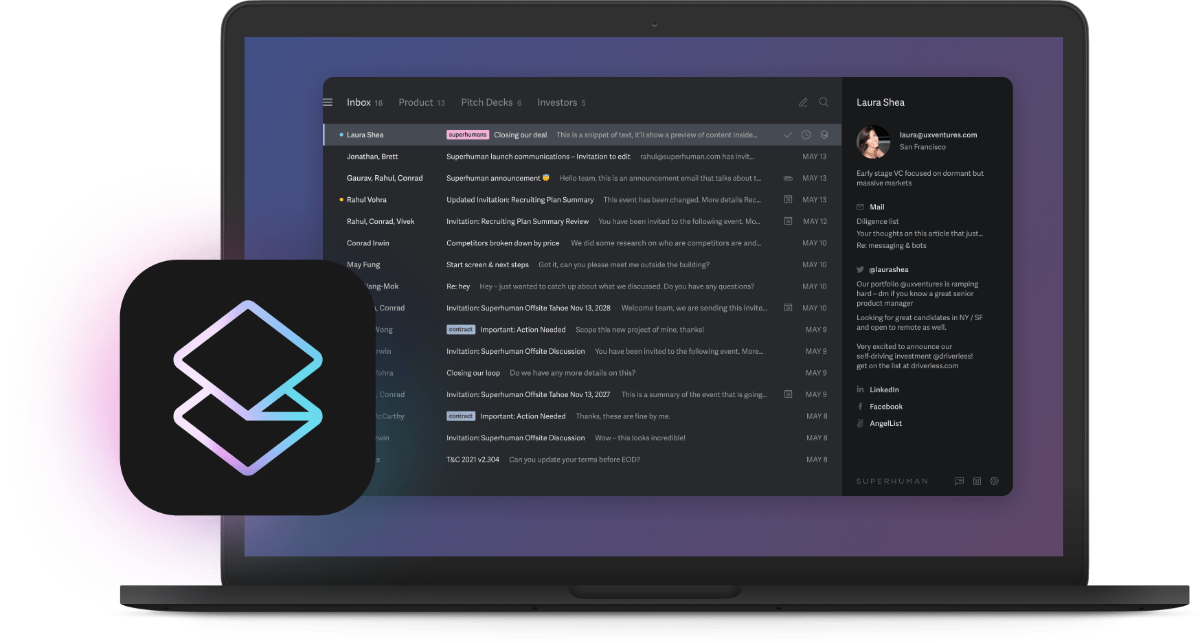
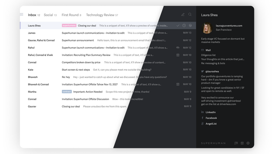
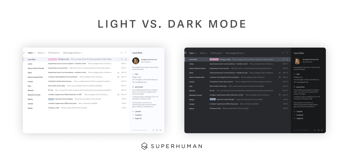
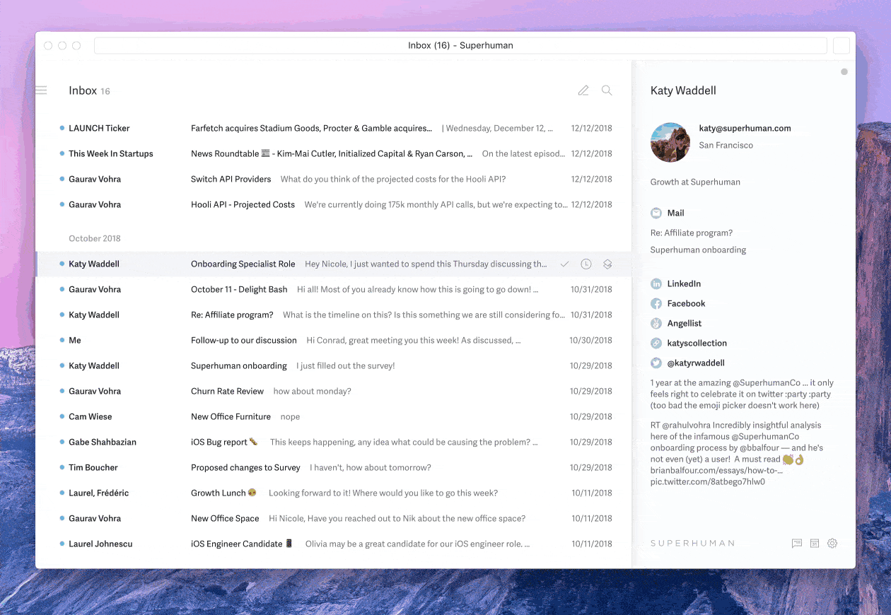
At Superhuman Mail, we created Carbon mode, a sleek, darker interface named after carbon fiber, the lightweight graphite weave that enabled a new era of aerospace performance. Unlike Gmail's dark mode (which simply inverts colors and creates a jarring, incomplete experience), Carbon was designed from five shades of gray. Nearer surfaces use lighter grays while distant surfaces use darker grays, creating natural depth and reducing eye strain in low-light environments.
Superhuman Mail can also match your system settings and adapt as lighting changes. As night falls, Superhuman Mail takes you from Snow to Carbon, from bright and clean to dark and minimal. Whether you're replying to emails or checking your calendar, Carbon remains consistently beautiful across every feature.
Why is dark mode so popular?
Dark mode has become a widespread interface option across devices and applications. Preferences are evenly distributed across all three modes: dark, light, and automatic switching.
This even distribution underscores an important finding: dark mode effectiveness is context-dependent rather than universally superior. This pattern appears consistently across eye health, cognitive performance, and accessibility research.
Lead designer at Superhuman Mail, Teresa Man, weighed in on app design and dark mode:
"Dark mode has become table stakes in software design because most OS devices have dark and light modes, so it's important that apps can conform to your settings of the OS theme."
Benefits of dark mode for sleep and circadian rhythm
The American Academy of Ophthalmology confirms that dark mode reduces blue light exposure compared to light mode. The organization notes that "warm colors are less likely to confuse your body into thinking it's daytime."
However, the organization emphasizes an important caveat: benefits depend on adjusting screen brightness and color temperature to match environmental conditions. Simply switching modes isn't enough.
Daily screen use in the hour before bed was associated with a 33% higher prevalence of poor sleep quality compared to those without pre-bedtime screen exposure (study of 122,124 adults).
Too much exposure to blue light at night can disrupt your circadian rhythm and slow melatonin production. The AAO recommends avoiding screens in the hour before sleep. When screen use is unavoidable, dark mode can help reduce blue light exposure. Keeping cumulative light exposure below 35 lx·h in the 2 hours before bed provides measurable melatonin protection.
Benefits of dark mode for eye strain
Dark mode can reduce eye strain and glare, specifically when using screens in dimly lit or nighttime settings. It lowers the contrast between screen brightness and surrounding darkness.
However, this benefit is context-dependent. In well-lit environments like typical office settings, dark mode may increase eye strain because dilated pupils make it harder to focus on lower-contrast text. Additionally, individuals with astigmatism may experience worsened readability with light text on dark backgrounds due to a "halo effect" where text appears to blur and bleed.
Clinical research found interesting results about visual fatigue:
- No significant difference in overall visual fatigue between light and dark modes
- Dark mode showed better critical flicker frequency (visual processing ability)
- Fewer dry eye symptoms with dark mode during extended screen use
The American Academy of Ophthalmology explains that digital eye strain relates to how we use our devices (we blink less) rather than the light emanating from them.
For more ways to reduce email fatigue and digital strain, consider tools designed with your well-being in mind.
Battery life benefits of dark mode on OLED devices
Dark mode's impact on battery life depends critically on display technology:
- OLED screens: Individual pixels can turn off completely for black colors. Power reductions range from 14% at 30% brightness to 67% at 100% brightness.
- LCD screens: Show minimal battery benefit from dark mode because the backlight remains constantly illuminated regardless of the displayed color.
OLED smartphones achieve 30-50% battery life extension when using dark mode. Samsung Display's official benchmarking on 2024 OLED laptops demonstrates 25% more display energy savings in dark mode versus light mode, translating to approximately 1 hour of additional battery life during typical usage scenarios.
An average person with default phone brightness settings around 30-40% might not notice substantial battery improvements. However, if you set your screen to a higher brightness (common in outdoor or well-lit office environments), you will save considerably more energy when switching to dark mode.
The dark side of dark mode: potential drawbacks
Is dark mode as beneficial as we think? Let's look at some of the potential downsides.
Visual conditions can affect dark mode usability
Imagine a stranger wearing dark clothing: do they look elegant and mysterious, or brooding and melancholy? Beauty is in the eye of the beholder, and so is dark mode.
For some people, specific visual characteristics can affect dark mode usability. Individuals with astigmatism, myopia, or presbyopia may experience worsened symptoms with dark mode, including a halo effect around light text on dark backgrounds that reduces text clarity. Others may prefer a brighter interface due to environmental lighting conditions or personal eye health needs. The key is offering choice rather than forcing a single mode.
Not all dark themes are created equal
Superhuman Mail's lead designer, Teresa Man, says:
"When creating a dark theme, it can be tempting to invert an existing light theme. However, distant surfaces would become light, and near surfaces would become dark. This would break physicality and feel unnatural."
In an earlier Superhuman Mail article, Man explains how to design a dark theme correctly.
"When designing a dark theme by referring to a light theme, it is important to revisit perceptual contrast. We adjust each item individually, considering text size, font weight, and line width, to ensure that the dark theme is as clear and as easy to read as the light theme."
Key design principles for effective dark themes:
- NOT using pure black backgrounds: "True black does not exist in our daily environment. Our vision has therefore adapted to perceive relative darkness as true black."
- NOT using pure white text on pure black backgrounds: "Pure white text against a pure black background produces the highest contrast possible: 21:1. However, contrast that is too high can cause eye fatigue, halation (particularly affecting the approximately 50% of people with astigmatism), and discomfort during extended use."
Material Design guidelines and Smashing Magazine's guide consistently recommend using dark grays (#121212 to #1E1E1E) rather than pure black to reduce harsh contrast and create more visually comfortable interfaces.
Understanding dark mode myths and misconceptions
Before diving deeper into the pros and cons, it's important to address some common misconceptions that have emerged around dark mode.
Myth: Dark mode universally reduces eye strain
Reality: Dark mode reduces glare in low-light environments. However, it can cause more eye strain in well-lit environments. The effectiveness depends entirely on your surrounding lighting conditions.
Myth: Dark mode saves battery on all devices
Reality: Battery savings only occur on OLED/AMOLED displays, where individual pixels can be turned off for black colors. LCD displays show minimal to no battery improvement because the backlight operates continuously regardless of the displayed content.
Myth: Dark mode is always better for accessibility
Reality: This is highly individual. Dark mode helps people with photophobia or light sensitivity. However, it can create challenges for people with astigmatism, who may experience light text appearing to bleed, blur, or glow against dark backgrounds. Since astigmatism affects approximately 47-50% of the population, this represents a widespread accessibility consideration.
Latest research on dark mode and cognitive performance
Recent scientific studies have examined how dark mode affects our ability to think, focus, and process information. The findings reveal a more nuanced picture than popular claims suggest.
173 participants showed that cognitive performance scores were higher in light mode than dark mode. However, the effects varied significantly by demographics:
- Younger adults performed better in light mode
- Individuals with academic education performed better in dark mode
- Gender differences: Men outperformed women in both modes, with the majority of females preferring light mode
An eye-tracking study found that dark mode improved accuracy and confidence on medium-complexity tasks. However, dark mode increased pupil dilation across all task types, indicating higher cognitive workload. This suggests people may perform more accurately, but their brains work harder, potentially leading to faster cognitive fatigue.
A systematic review reached an important conclusion: no scientific consensus exists on dark mode advantages or disadvantages for cognitive performance, largely due to methodological inconsistencies and individual differences.
Understanding how AI tools can complement your work environment setup helps maximize productivity regardless of display preference.
When dark mode provides the most benefit
Not all apps benefit equally from dark mode. Research suggests dark mode makes the biggest difference in these scenarios:
- Long sessions: The longer you spend looking at a screen in one sitting, the greater the potential for eye strain and battery drain. Email clients, ebook readers, and document editors benefit most from dark mode options.
- Frequent usage: Apps you check repeatedly throughout the day accumulate more screen time than you might realize. Messaging apps, email, and productivity tools fall into this category.
- Low-light conditions: If you typically use an app in darker environments, dark mode prevents the jarring blast of bright screens when your pupils are dilated. Streaming apps, white noise apps, and yes, late-night email checking all qualify.
- Text-heavy interfaces: Media like photos and videos look identical in dark and light modes. The more text-dominant your workflow, the more difference dark mode makes. Social media feeds full of images see minimal benefit; an inbox full of messages sees substantial benefit.
Best practices for implementing dark mode effectively
Given the mixed research findings and individual variations, how should organizations approach dark mode implementation? Here are evidence-based recommendations:
- Always provide choice - Preferences are evenly distributed across all three modes. WebAIM's April 2025 guidance recommends providing choice and avoiding forcing either mode. Some people have medical conditions (such as astigmatism or photosensitivity) that make one mode significantly harder to use.
- Follow accessibility standards rigorously - Both dark and light modes must independently meet WCAG 2.1 standards requiring a 4.5:1 contrast ratio for normal text. Use tools to test each mode separately rather than assuming one mode's compliance applies to both.
- Use dark grays instead of pure black - Design best practices recommend using dark grays (#121212 to #1E1E1E) instead of pure black backgrounds to reduce harsh contrast while maintaining sufficient contrast ratios for accessibility.
When should you use dark mode vs light mode?
Based on the latest research and expert recommendations, here's a practical framework for choosing between dark and light modes:
Use dark mode when:
- Working in dimly lit environments or at night
- Experiencing light sensitivity or photophobia
- Using OLED devices where battery conservation is important
- Wanting to reduce blue light exposure before bedtime
- Your device automatically switches based on ambient light sensors
Use light mode when:
- Working in well-lit environments: Light mode performs better in brightly lit office settings. It reduces glare and provides optimal contrast.
- Intensive reading or maximum text clarity is essential: Light mode resulted in higher cognitive performance scores in information retrieval tasks.
- You have astigmatism, myopia, or presbyopia: Individuals with these conditions may experience worsened symptoms with dark mode, including a "halo effect" around light text on dark backgrounds.
- You're working during daytime hours: Dark mode's benefits are primarily relevant for evening and nighttime use.
Consider switching between both when:
- Your work environment lighting changes throughout the day
- Different tasks require different visual approaches
- You want to match your device's automatic theme switching
The key insight is that preferences are deeply individual. Context and individual differences matter more than universal rules. Experiment with both modes and pay attention to your comfort, productivity, and any eye strain symptoms.
Optional Reading: How to read faster.
Experience the benefits of dark mode with Superhuman Mail
You can find conflicting and even controversial information on dark mode. But at the end of the day, it all comes down to personal preference and context. If you love it, you're in good company. About one-third prefer dark mode exclusively, and recent clinical research shows measurable benefits for specific visual metrics, including improved critical flicker frequency and reduced dry eye symptoms in low-light environments.
Superhuman Mail's Carbon mode goes beyond simple color inversion. It uses graduated gray tones that create natural depth, matching how we perceive light in the physical world. Superhuman Mail is also the fastest email experience ever made. Teams respond 12 hours faster, reply to twice as many emails, and save 4 hours per person every week.