The Making of Superhuman Docs: How We Brought a New Visual Identity to Docs

Today, we announced Coda is becoming Superhuman Docs, the best place for AI and teams to work together. This is more than a name change; it’s the beginning of an entirely new chapter. Coda had spent a decade building a loyal, passionate user base, and bringing it into the Superhuman product suite meant honoring that legacy while reimagining what the product could become.
Jessica Svendsen, Brand Experience Lead, helped shape the overall visual direction of the rebrand, working across the full Superhuman suite to develop a cohesive new identity. Namika Hamasaki, Staff Product Designer, was responsible for translating that vision into the Docs product—navigating the real constraints of accessibility, user habits, and the editor surface at the heart of Docs.
We sat down with both of them to talk through the philosophy behind the redesign, the details they sweat, and what they’re most excited for users to experience.
What does it mean to redesign a product like Coda, one that people have loved for years?
Jessica Svendsen: Throughout this project, the question we kept coming back to was: How can we make this feel like the most well-crafted editor surface on the market? We really focused on designing a product and a piece of software that you want to spend a long time in and do a lot of great work with.
All of the moves we made—giving it a warmer palette, upgrading the iconography, introducing a new typeface—these are maybe subtle changes, but the level of detail now in the product reflects not only the power of Docs, but the potential delight and joy of working in a well-crafted surface every day.
Namika Hamasaki: From the product side, it was about understanding the brand vision and the product constraints at the same time. You can build a beautiful color palette, but for a product, you also need to consider accessibility and color contrast. Every decision I made was about translating the Superhuman brand essence into the Docs product—without losing the elements that made people fall in love with Coda.
How do you make sure a product feels like it belongs to a suite without losing its own identity?
JS: Coda was such a well-designed product to begin with, so a lot of our decisions were about bringing it into a larger vision rather than reinventing it. Color is a good example—and one of the trickier ones, because color does a lot of work.
Purple is our brand color, and we wanted it to feel intentional rather than ubiquitous. For example, we actually moved away from using purple for selected states because when it appears on every selected row or tab, it stops feeling like a brand moment and starts feeling like clutter.
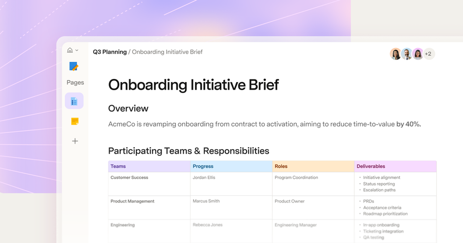
NH: The same thinking applied to the background color of the surface—the navigation and panels that frame where you write and work. It’s now a warm cream—the same tone we’ll use across the Superhuman suite. But that color choice isn’t just a brand signal. We wanted the overall experience to evoke a feeling of warmth—a nod to the analog, like paper on a physical desk.
What design decisions were specific to how people actually use Docs?
NH: One thing we kept coming back to was: How does a user always know where their work lives? The answer became what we call the elevation system—a way to give the interface a sense of depth, so that some elements appear to sit above others.
The inspiration was a desk. The canvas is the paper on top, and everything else—the settings panel, table controls, and AI chat—recedes into the background. The page now actually sits above the rest of the navigation. It lets users focus, but it also gives the interface a warmth and texture you don’t see in many user interfaces today.
Where do you draw the line between evolution and disruption?
NH: One of the key things I learned from beta testing was that users were genuinely very positive about the new user interface, but they also wanted to make sure that their content, their writing, wouldn’t be disrupted. Because of that, we were especially careful with any redesign work inside the canvas. The canvas is the user’s space. We continued defining elements like color and typography based on their feedback, and we prioritized testing the highest-impact changes there first.
JS: We were also very attentive to ensuring brand expression showed up at the right altitude—supportive to users rather than too loud or distracting. The canvas is where people spend their time. Everything else—the icons, the spot illustrations, the warmer palette—was designed to serve that, not compete with it.
Typography is one of those things users feel before they notice. What changed, and why?
JS: We switched from Inter—an almost operating-system-level font that a lot of teams use—to Super, our new custom font family. It has three styles: Super Sans, Super Serif, and Super Mono.
What’s great about Super is that all three styles were designed cohesively, so even if you’re switching between sans and serif, everything still feels familial. It gives each product a range of type tools—from restrained to expressive—and you’ll start to see that play out in places like empty states and success moments.
The real goal is to make sure Super feels really great to read and write with, right out of the box. One of the things I love about an editing surface that’s really well crafted is that you don’t have to spend a lot of time formatting—it’s been designed so you can just get to work.
What’s the detail you hope people stop to notice?
NH: I really love the new icons and the colors. The icon designers created over 500 custom icons. A key priority was not to disrupt the user’s existing experience; the brand team mapped every Coda icon to a new one so nothing was missed.
JS: I’m excited about what we’re calling spot icons—used for moments when you need to celebrate that a user completed a step, or reinforce that something might be empty. And in the future, we’re planning to introduce even more dynamic ways, like stickers, for users to react and express themselves. Those are the moments when the brand really shows up in a way that feels human.
What does it mean to have built something designed to grow?
NH: A design system is essentially the rulebook that governs how a product looks and feels—every color, every component, every decision about spacing and type. Ours is called Origin, playing a bit on the Superhuman theme. As we grow into a full product suite, it’s the source of truth that carries the brand essence into everything new. Whatever we add next, it starts there.
JS: And I think that’s what makes this moment exciting. This isn’t a rebrand that ends at launch—it’s a foundation. The work we’ve done on Docs sets the standard for how every product in this suite should feel to use. We’re just getting started.